Give Now


Tag Archives: 1600s

Object of the Month: March 2026

St. Veronica

Oil on canvas

Claude Vignon

French, 1593-1670

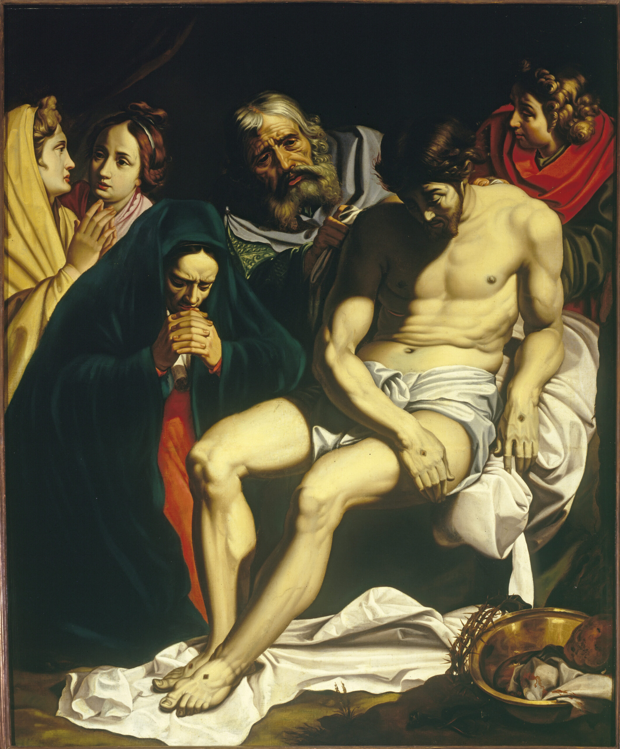
The legend of St. Veronica is a tangled one. Whether she is based on a woman named Berenice, the woman with the issue of blood, or merely a weeping woman of Jerusalem, the important thing is that there is no Biblical foundation to her story. Veronica is said to be a widow who pitied the Savior and offered Him her veil to wipe His sweaty, bloodstained face. He accepted, and when He returned the veil, it bore His likeness.

In the world of art, her iconography includes the face-imprinted cloth, as in M&G’s painting by Claude Vignon. The religious have long sought relics of biblical personages. This veil with its miracle-produced image is considered the vera icon or “true image” to distinguish it from all other images of Christ. Over time the cloth became known as a veronica (also a sudarium) and the woman as “Veronica.”

Luke 23:28 states that Christ tells the mourning women following Him to Calvary, “Daughters of Jerusalem, weep not for me, but weep for yourselves, and for your children.” These are not the devoted Galilean women; these are women of Jerusalem who doubtless heard of or even participated in the mob cry, “Let his blood be upon us and our children” outside Pilate’s palace. Christ denies their pity for Himself; His death is a permanent payment for sin, but He will rise again. Instead, He confronts them with the consequences of their nation’s rejection of the Son of God (Luke 23:29-30). Whether He foretells the cruel Roman destruction of Jerusalem (A.D. 70) or the ultimate judgment of the earth when the Jews recognize fully their sin in rejecting Him (Revelation 6:16) or both destructions, Jesus’ words point up the irony that their sympathy should lie with the living, not the soon-dead, innocent One (the “green tree” in Luke 23:31).

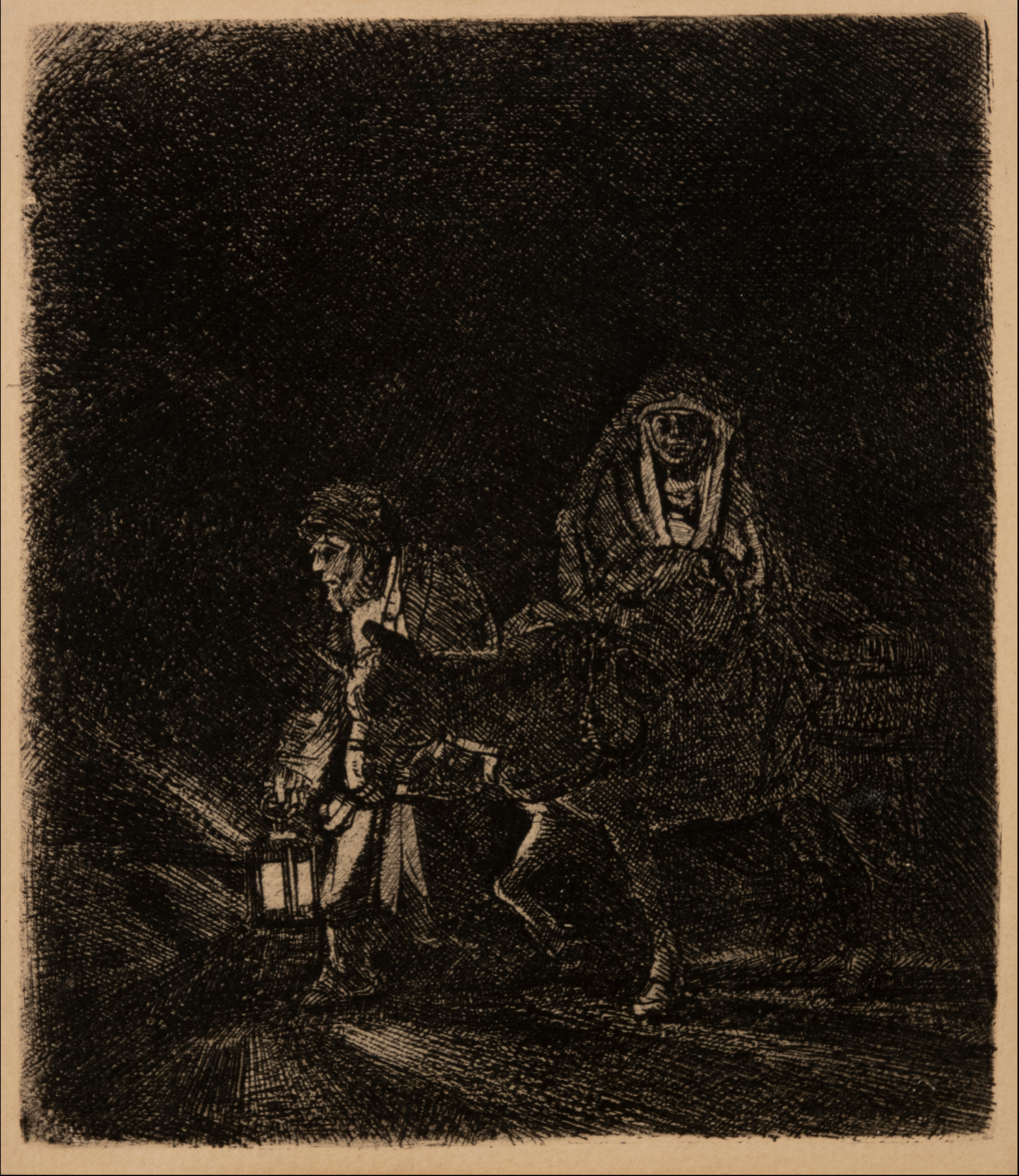
Vignon painted another work with a veronica, this time with angels holding the cloth. It is intriguing to consider the variations of the face of Christ. M&G’s St. Veronica depicts a corpse-like appearance similar to a death mask with a face drained of color, eyes closed, and a marked lack of blood from both the crown of thorns and the soldiers’ abuse. It is clearly not a true image of Christ on His way to Calvary, though His blood loss must have been severe. However, the visage on the cloth that the two angels display is much more like the face the women saw—a man abused, yet fully aware. Why Vignon painted such different versions of the vera icon, aside from being ironic, is a mystery.

Two Angels Presenting the Holy Face, Claude Vignon
Musee des Beaux-Arts, Rouen, France

The vibrant colors and use of chiaroscuro suggest the influence of the Caravaggisti that Vignon encountered in Rome during his travels. The different coloring between these two works highlights the variety that is found in Vignon’s style in general and causes the viewer to understand the validity of one critic’s comment that “a wealth of hues plays a large part in the poetry of the work of Claude Vignon.”

He was employed by King Louis XIII as well as Cardinal Richelieu, commissions that speak to his skill and popularity. A man of varied talents (painter, etcher, and art salesman), Vignon drew together the influences of Mannerism, Colorism, Caravaggism, and even of Rembrandt and produced works that mark him as “one of the most important and most distinctive French painters of his generation.”


Dr. Karen Rowe Jones, M&G Board Member


Published 2026

Rembrandt Harmensz. van Rijn

Flight into Egypt: A Night Scene

Rembrandt Harmensz. van Rijn

Below the image, click play to listen.


God’s Covenant with Noah, Unknown Roman

This work by an unknown 17th-century Italian painter beautifully unfolds the message of unmerited grace offered to mankind by a holy God.

Object of the Month: November 2025

The Triumph of David

Oil on canvas, c. 1630s

Jacopo Vignali

Florentine, 1592-1664

Italian art scholar Howard Hibbard once observed, “Florentine seventeenth-century art has a fascination and beauty worthy of our attention: it is a sensuously colorful and romantic school of painting, sometimes even magical or mystical.” The Museum & Gallery’s Triumph of David by Jacopo Vignali is a case in point. Described as one the most “poetic and sensitive” of the Florentine painters, Vignali began his career at 13 under the tutelage of Matteo Rosselli. In his early twenties he joined several other noteworthy artists in the decoration of the Casa Buonarotti—the most important commission in Florence at that time. By his early thirties, he was not only a member of the Academy but also one of the leading artists in Florence.

Rosselli’s superb tutelage provided Vignali with the technical and artistic skills necessary for his later success. However, as Vignali’s style matured, he became more eclectic, incorporating Counter-Mannerism with the grandeur, drama, and emotional intensity of the emerging Baroque aesthetic. This diversity is clearly apparent in The Triumph of David.

Seventeenth-century paintings on the life of David had been prevalent since the 15th century when the innovative, stunning sculptures of Donatello, Verrocchio, and later Michelangelo elevated this biblical figure into a civic symbol. Interestingly, our M&G painting was originally attributed to Vignali’s teacher Rosselli. Joan Nissman notes: “The answer to this problem of attribution, as Del Bravo suggests, seems to be that it is an early work painted while Vignali was still under the influence of his master. Vignali, in this painting, shares his master’s solid and smooth technique as well as his concern for details of costume.” However, a comparison of Rosselli’s treatment of the subject [fig. 1] with Vignali’s highlights why Carlo del Bravo’s attribution of the work to Vignali (rather than Rosselli) has now won general acceptance.

fig. 1 THE TRIUMPH OF DAVID, Matteo Rosselli

Notice that in Rosselli’s rendering we see the coloration, composition, and scale indicative of the classical Baroque style popularized by the Carracci. In contrast, Vignali’s more dynamic composition, vivid coloration, and careful use of scale reflect his mature style which favored the integration of Counter-Mannerist techniques with the dramatic realism of Baroque naturalism. For example, High Mannerist paintings were often characterized by strained poses, distortion of the human form, crowded compositions, garish coloration, and unusual (sometimes bizarre) elements of scale.

In this scene, however, Vignali manipulates these common characteristics to create a “restrained” but equally dramatic effect. For example, the composition is “crowded” but the poses elegant, the figures without distortion. The coloration is vivid but not garish, carefully integrated to create focus and highlight the triumphant mood of the scene (e.g., David’s bright red stockings draw the eye to Goliath’s head while the bright red sleeves of the woman’s costume create an implied horizontal line that guides the viewer’s eye back to the hero’s face).

Vignali also carefully manipulates scale. The extreme elongation of the sword and the enormous head of Goliath subtly serve to reinforce the power of the biblical narrative. Scripture notes that Goliath was about 9 feet tall, and although we are not told specifically how much his sword weighed, we do know that the head of his spear weighed about 15 pounds! In addition, the soft modeling of the faces, the contemporary dress, and the morbidly gruesome severed head highlight Baroque naturalism’s penchant not just for realism but also for the “bizarre and strident” (David Steel).

Although Vignali’s contributions to the early Baroque period are significant, he remains less well-known than either his teacher Matteo Rosselli or his most famous student Carlo Dolci. Joan Nissman attributes this lack of name recognition to the fact that, unlike Roselli and Dolci, the great seventeenth-century Florentine biographer, Filippo Baldinucci, did not write of Vignali’s life. Regardless, this work has long been praised as one of the finest treatments of The Triumph of David ever produced.


Donnalynn Hess, Director of Education


Works Cited:
Steel, David, Baroque Paintings from the Bob Jones University Collection. North Carolina Museum of Art.1984.
Hibbard, Howard and Nissman, Joan, Florentine Baroque Art from American Collections. The Metropolitan Museum of Art. 1969.


Published 2025

The Holy Family with St. John the Baptist: Michel Corneille, the Younger

In this beautifully tranquil scene, Michel Corneille includes a variety of traditional symbols highlighting Christ’s sacrifice for our sin.

Object of the Month: September 2025

Sea Captain’s Chest

Oak, Initialed and Dated: 1614

Dutch, 17th century

The Museum & Gallery’s renowned collection of art reflects timeless Truth communicated over centuries of storytelling by the most notable artists of their day. These artists sought to share transcendent spiritual realities, but each was limited to the historical “palette” available to them—levels of biblical understanding, historical and geographical knowledge, national boundaries and cultural context. While studying the artworks, we also learn of the cultural landscape of their time.

In a way that is unique in the art world, the Museum & Gallery’s important “canvasses” are not just on the walls. The nearly 150 pieces of medieval, Renaissance, and Baroque furniture expand our knowledge of the eras in which they were made and the distinctive purposes for which they were created.

Take for instance this Dutch Sea Captain’s Chest. Made from dense, rot-resistant Northern European oak, constructed with sides that splay outward as they rise toward the domed lid (in order to fit against a ship’s interior hull) and including a second, smaller compartment inside, the chest is bound with thin iron strapwork that serves as structural reinforcement, security, and decorative purposes. Engraved on the substantial lock are the year (1614), month (December) and initials of its maker or owner (CNDE). While most sailors had a small, simple sea chest, a captain’s sea chest would reflect the greater size of his responsibility, his social position, and the types of things that would be needed during an 8–10-month voyage (charts and maps, important trade documents, the sailors’ pay, and personal possessions). Such chests were a necessity, but they also came to be artworks in their own right.

This M&G chest hails from the Dutch Golden Age, which extended from the 17th through the early 18th centuries. This era witnessed an explosion of Dutch arts, trade, wealth and world standing. Rembrandt (1606-1660) and Vermeer (1632-1675) both lived in the 1600s, and they recorded the wealth and complexity of their society. Many of their patrons and subjects were astoundingly wealthy noblemen and merchants. None of this would have been possible without Dutch sea trade and the ships’ captains, who facilitated it.

The main engine of Holland’s wealth and global importance was the Dutch East India Company (or Verenigde Oostindische Compagnie, VOC). Founded in 1602 and liquidated in 1795, the VOC was the most significant of the early European trading companies operating in Asia, and a little background is in order.

In 1579 the Treaty of Utrecht united the Low Countries (the seven northern provinces) in their struggle for independence from the Spanish/Hapsburg rule, forming what would become the Republic of the United Netherlands. Even before this union the mariners and merchants of these provinces were the most prolific and successful in the region. In 1599, likely using information gained through espionage, the first Dutch fleet attempted to break Portugal’s monopoly of the Asian spice trade. The endeavor was only mildly successful financially, but it showed what might be done.

By 1602, so many Dutch companies were competing for the spice trade that the price and glut of spices in Europe became an issue. In a single act of fiat, the Dutch government amalgamated these companies into a single entity, the United Dutch East India Company. The government gave the company a monopoly on the spice trade via the Cape of Good Hope, and it would become a behemoth.

By the middle of the 1600s the Dutch East India Company would own 150 ships, have 50,000 employees worldwide, field a private army of 10,000 soldiers, and maintain outposts from the Persian Gulf to Japan. This, the world’s first truly multinational company, had the right to wage war, create new colonies, make treaties, punish and execute criminals, and coin its own money. Between 1602 and 1796—a time when a round-trip voyage from Amsterdam to Jakarta required at least 8-10 months—the Dutch East India Company conducted more than 5,000 voyages between Holland and Asia.

In a single object, M&G’s Dutch Sea Captain’s Chest embodies a Golden Age of art, exploration, and trade.  Similar chests would have been familiar to Rembrandt, Hals and Vermeer, and it’s fitting to have such a chest in the Collection. If we listen, they illumine us about both their own cultural moment and the influence that culture continues to have upon the world as we know it.


Dr. Stephen B. Jones, M&G volunteer


Resources:

Museum of Western Australia

en.unesco.org

World History Encyclopedia


Published 2025


Object of the Month: August 2025

Lamentation over the Dead Christ

Oil on panel, c. 1610–12

Abraham Janssens

Flemish, c. 1575–1632


When the word “baroque” is mentioned, there are two names that people associate with this art history movement—Italian artist Michelangelo Merisi da Caravaggio and Flemish artist Peter Paul Rubens. Both artists dominated Europe with their dramatic scenes, rich colors, chiaroscuro, accomplishments, and larger-than-life personalities. In the shadow of these masters and their artistic masterpieces, other artists have done their best to imitate or infuse their own style with these titans’ techniques. One such artist is fellow countryman to Rubens, Abraham Janssens.

Janssens’s work had impressive range. Throughout his career, his subject matter included biblical, historical, and allegorical scenes as well as occasional portraits. His stylistic changes are perhaps the most interesting. The first paintings of his oeuvre would be labeled Flemish Mannerist. Then after a trip to Italy in the early 1600s, he began to adopt a more Caravaggesque approach. Finally, his work became more Rubenesque after Rubens returned home and began to command the Flemish art scene. Janssens’s shift in his different styles can be seen in one specific subject matter—the Lamentation of Christ.

The Lamentation of Christ is an extra-biblical subject that portrayed groups of people mourning around the dead Christ. As mentioned in the gospels (Matthew 27:59-61, Mark 15:46-47, Luke 23:53-56, and John 19:38-42), this group usually included His mother, Mary, and various others. It is the perfect subject matter to compare Janssens’s stylistic shift since it shows strong emotion, sculptural figures, and a dramatic biblical narrative.

First, is Janssens’s Lamentation of Christ painted between 1600 and 1604. This work shows typical Mannerist characteristics with its bright colors and elongated figures. There is emotion, but it is not the intense drama of the Baroque. Since Janssens was in Rome from 1598-1601, it is interesting to note that he did not immediately adopt Caravaggio’s style. According to 17th-century Dutch painting scholar, Justus Müller Hofstede, most of Caravaggio’s early innovations in Italian painting (ca. 1593-1598) such as half-figure compositions, still-life painting, and secularization of religious themes were already in use in Antwerp. Hofstede concludes that Caravaggio’s early pioneer work wouldn’t have impressed Janssens.

It wasn’t until 1607 that Janssens began incorporating Caravaggio’s technique. This style is wonderfully shown in the Museum & Gallery’s Lamentation Over the Dead Christ, painted between 1610-1612. There is a marked stylistic shift to baroque characteristics compared to the first Lamentation. There is a sculptural, monumental quality to his figures, which would become a trademark of Janssen’s career. The lighting is harsh and dramatic and reminiscent of Caravaggio’s best works. This Lamentation also shows an extreme depth of sorrow. The furrowed, anguished brow on Mary is a contrast to the first Lamentation’s rather passive Mary.

Finally, Janssens began adapting to a Rubenesque approach. His later The Lamentation over the Dead Christ painted in 1621-22 includes similar elements from M&G’s Caravaggesque example. However, it does not have the same harshness or extreme sorrow. You can see Rubens’s influence in the rich coloring and more dramatic movement throughout the composition. Janssens still maintains his trademark stiffness and sculptural feel to his figures. According to historian Irene Schaudies, it is Janssens’s focus on his figures looking like classical statues rather than painting from empirical observation like Caravaggio and Rubens that kept Janssens in their shadow. Nevertheless, by looking at these three paintings, one can appreciate what a master Janssens was with his different stylistic portrayals of one of the most emotive scenes in Scripture.


KC Christmas Beach, M&G summer art educator


Published 2025

Samson Slaying the Philistines: Orazio de’ Ferrari

Orazio de’ Ferrari skillfully captures one of the Old Testament’s most powerful stories.

The Triumph of Miriam: Luca Giordano

Luca Giordano, a child prodigy, would become one of the Baroque era’s most noted Neapolitan artist.  M&G has at least three of his works including The Triumph of Miriam.

Christ Teaching on the Mountain: Pieter Jan van Reysschoot

Flemish artist Pieter Jan van Reysschoot masterfully illustrates Christ’s use of creation to teach the multitudes about God’s compassionate character.