Flemish artist Pieter Jan van Reysschoot masterfully illustrates Christ’s use of creation to teach the multitudes about God’s compassionate character.
Tag Archives: baroque
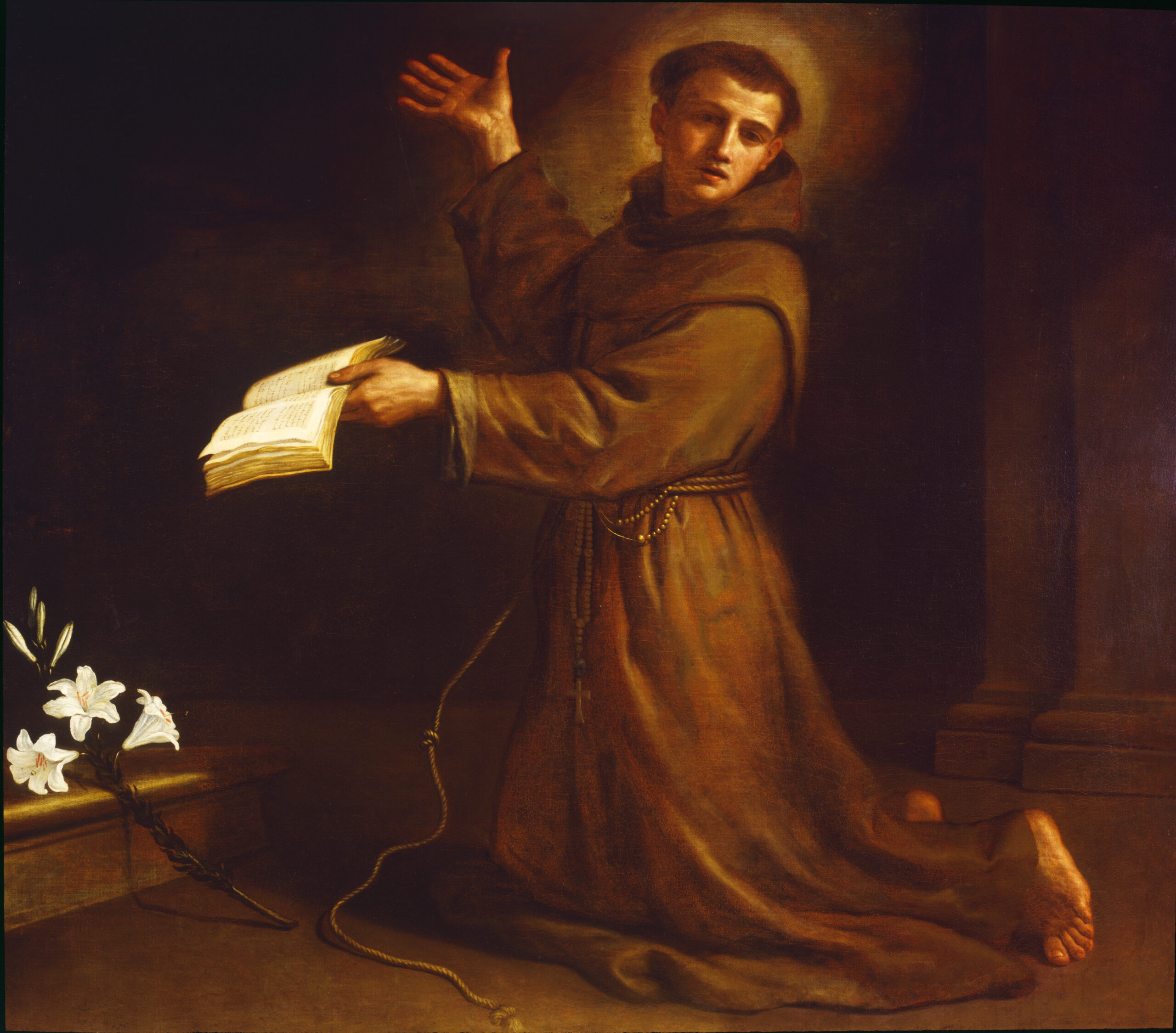
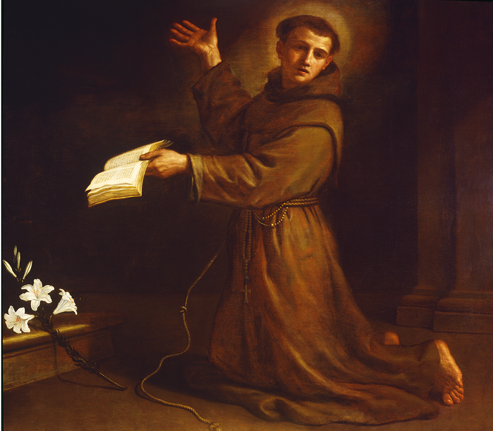
St. Anthony of Padua
Oil on Canvas, 1658
Giovanni Francesco Barbieri, called Il Guercino
Cento, 1591–1666
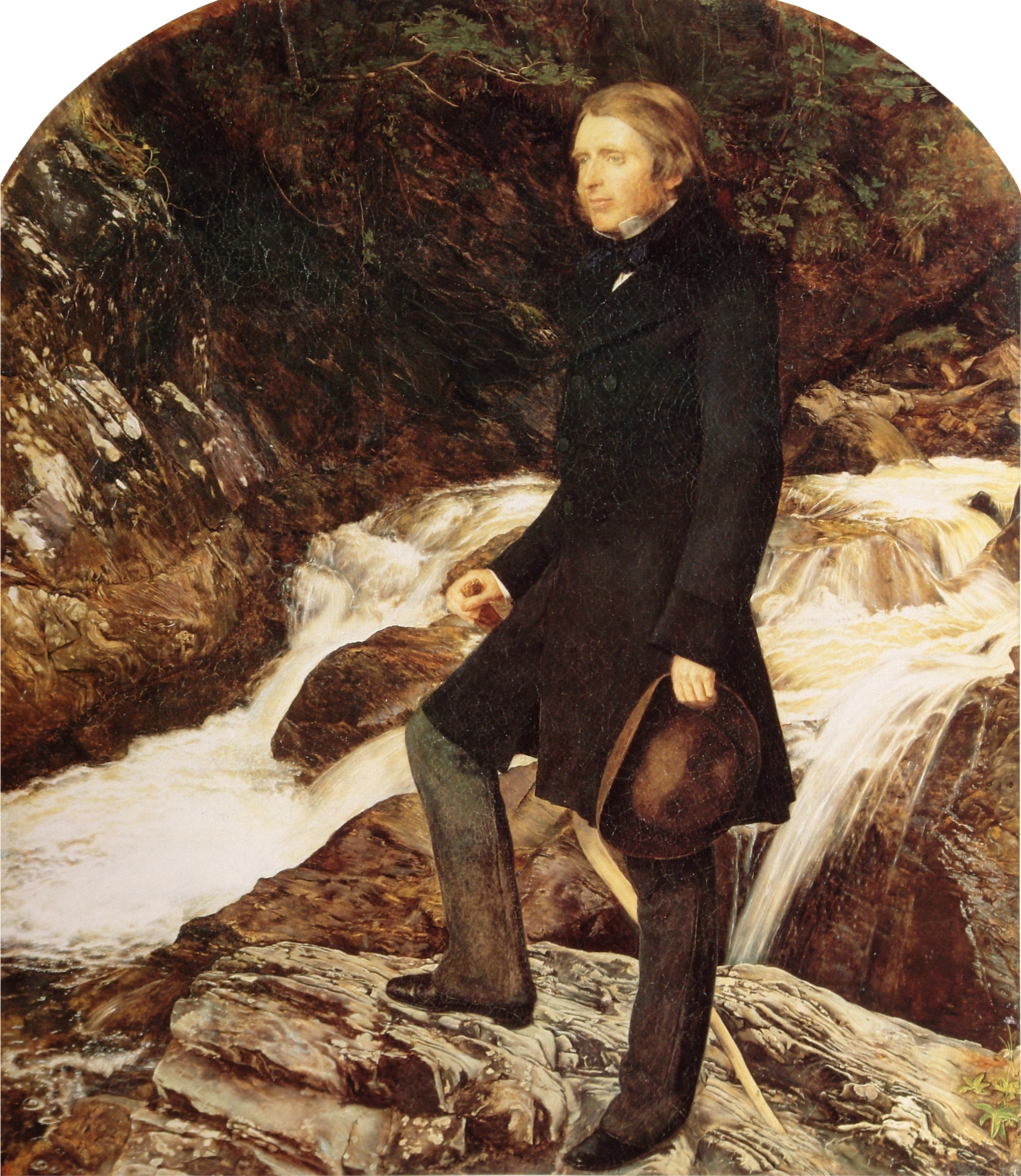
Long before social media, opinions were influential. And, in art history, opinions have affected perspectives toward artists and their work for entire generations. One example of this is the brilliant philosopher of the Victorian era, John Ruskin, who was an art critic that championed JMW Turner, Britain’s greatest landscape painter. Ruskin preferred and praised the contemporary artists of his day such as Turner and the Pre-Raphaelites, the art prior to Raphael, and the Gothic style.
In contrast, Ruskin’s opinion about the Italian Baroque period can essentially be summed up by his reaction to one painting in the Brera Gallery in Milan by Guercino, “partly despicable, partly disgusting, partly ridiculous” (Ruskin, p.203). He classified many of the great seventeenth-century painters within what he labeled “the School of Errors and Vices” (Ruskin, pp.144-45). Such strong views influenced the collecting habits of collectors and museums in Europe and America for several decades. Consequently, Baroque artists are still recovering from the stigma; their names are not as well-known as the Renaissance masters even though their skill is of equal quality.
Giovanni Francesco Barbieri, called Il Guercino was one of the most important and talented painters of the Italian Baroque period. He hails from the region of Emilia-Romagna, born in the small town of Cento, which is close in proximity to the artistic centers in Ferrara and Bologna. He was largely self-taught (influenced by works of Ludovico Carracci and Caravaggio), although he studied with local artists Paolo Zagnani and Benedetto Gennari.
Guercino’s nickname means squint-eyed or cross-eyed possibly due to an eye condition, yet this disability didn’t seem to affect his work. Ludovico Carracci praised him in Bologna, and his “genius was recognized by the Bolognese canon Padre Antonio Mirandola, who became his earliest protector and obtained the artist’s first Bolognese commission in 1613” which established his career. “He was then patronized by the papal legate to Ferrara, Cardinal Jacopo Serra,” Duke of Mantua Ferdinando Gonzaga, and the Bolognese cardinal Alessandro Ludovisi, who later become Pope Gregory XV— summoning Guercino to Rome in 1621 (de Grazia, p.157).
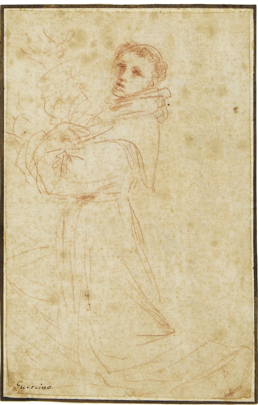
Guercino study of St. Anthony of Padua from Glasgow Museums
Following the pope’s death in 1623, Guercino returned home to Cento to work, painting a wide range of subjects and drawing countless distinctive studies in red chalk and ink. As an artist, he was truly inventive, a real creative. He would put his ideas to paper very quickly and spontaneously—something his biographer Malvasia described as guizzanti, meaning “dart with a flick of a tail, as fishes” (Brooks, p.12).
Among other requests, he was asked to become official painter to the courts of England (1626) and France (1629 and 1639). After the death of his archrival Guido Reni in 1642 he moved his studio to Bologna. By the 1650s, his European patronage had tapered to more local commissions, which is when M&G’s painting was made.
St. Anthony of Padua features the thirteenth-century Doctor of the Church, who was born in Lisbon. He joined the Franciscan Order (represented by the dark brown robe and tonsure haircut) and became a close friend and follower of Francis of Assisi. He had a vast knowledge of scripture and was a gifted preacher, serving in France and Italy including Bologna and Padua, where he died. After his death, he was made the patron saint of Padua.
In art, Anthony is depicted in various scenes describing events from his life. M&G’s subject is the vision of the Virgin and infant Christ—a common theme during the Counter Reformation. The vision came while Anthony was in his room, and he is portrayed with a book (which identifies his learning), lilies (representing his purity), and a crucifix (in the shadows above the lilies).
At the time of acquisition in 1973, M&G’s founder knew that this painting was referenced in the artist’s account books—it was one of two St. Anthony altarpieces recorded. The great Guercino and Baroque specialist, Sir Denis Mahon wrote Dr. Bob, “I have no doubt whatsoever from studying the painting itself that it is an authentic late work by Guercino…. It was the lower half of a picture which had been very much bigger…. It follows that the picture is likely to have originally been a full-size altarpiece” (M&G files).
In the 1990s, Richard Townsend found that of the two St. Anthony altarpieces referenced in Guercino’s account books, one was still in Verona and the other cut in two and sold. This work remained a mystery, until recent years when Italian art historian Enrico Ghetti pieced together the history based on the confusing details in Guercino’s Book of Accounts and Malvasia’s biography. M&G’s painting was once called the Madonna and Child with Saint Anthony of Padua and paid for in 1658 by Pier Luigi Peccana (from Verona) most likely on behalf of the Marquis Gaspare Gherardini. The altarpiece used to hang in the Chapel of Saint Antony at the Capuchin church of Verona.
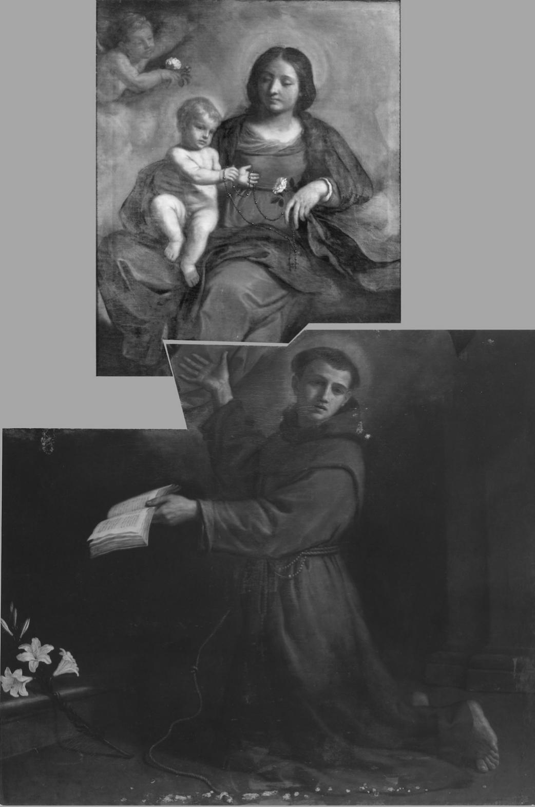
Ghetti Reconstruction
Ghetti suggested the painting, Madonna with Child, which was formerly in the Sgarbi collection in Italy is most likely the upper portion of our work; he has proposed a reconstruction of the dismembered altarpiece as seen here.
M&G’s painting reveals some of the standard matters art historians encounter regularly: the influence of art critics like John Ruskin, the connoisseurship of art specialists like Sir Denis Mahon, dismembered altarpieces, and confusing primary records for art scholars like Enrico Ghetti to ferret out. More importantly, this interesting work represents one of the most notable and innovative Italian painters of the seventeenth century.
Erin R. Jones, Executive Director
Bibliography
Brooks, Julian. “Characterizing Guercino’s Draftsmanship.” Guercino: Mind to Paper. Getty Publications: Los Angeles, 2006.
De Grazia, Diane. “Giovanni Francesco Barbieri, Called Il Guercino.” Italian Paintings of the Seventeenth and Eighteenth Centuries: The Collections of the National Gallery of Art Systematic Catalogue. National Gallery of Art, Washington: New York, 1996.
Ghetti, Enrico. 2020. “La ricostruzione di una pala del Guercino: la Madonna col Bambino e sant’Antonio d Padova per i Cappuccini di Verona,” Storia dell’ Arte 153, Nuova Serie 1.
Ruskin, John. Modern Painters (vol. ii), ed. Edward T. Cook and Alexander Wedderburn. George Allen: London, 1903.
Ruskin, John. Ruskin in Italy: Letters to His Parents, 1845, ed Harold I. Shapiro. Clarendon Press: Oxford, 1972.
Published 2025
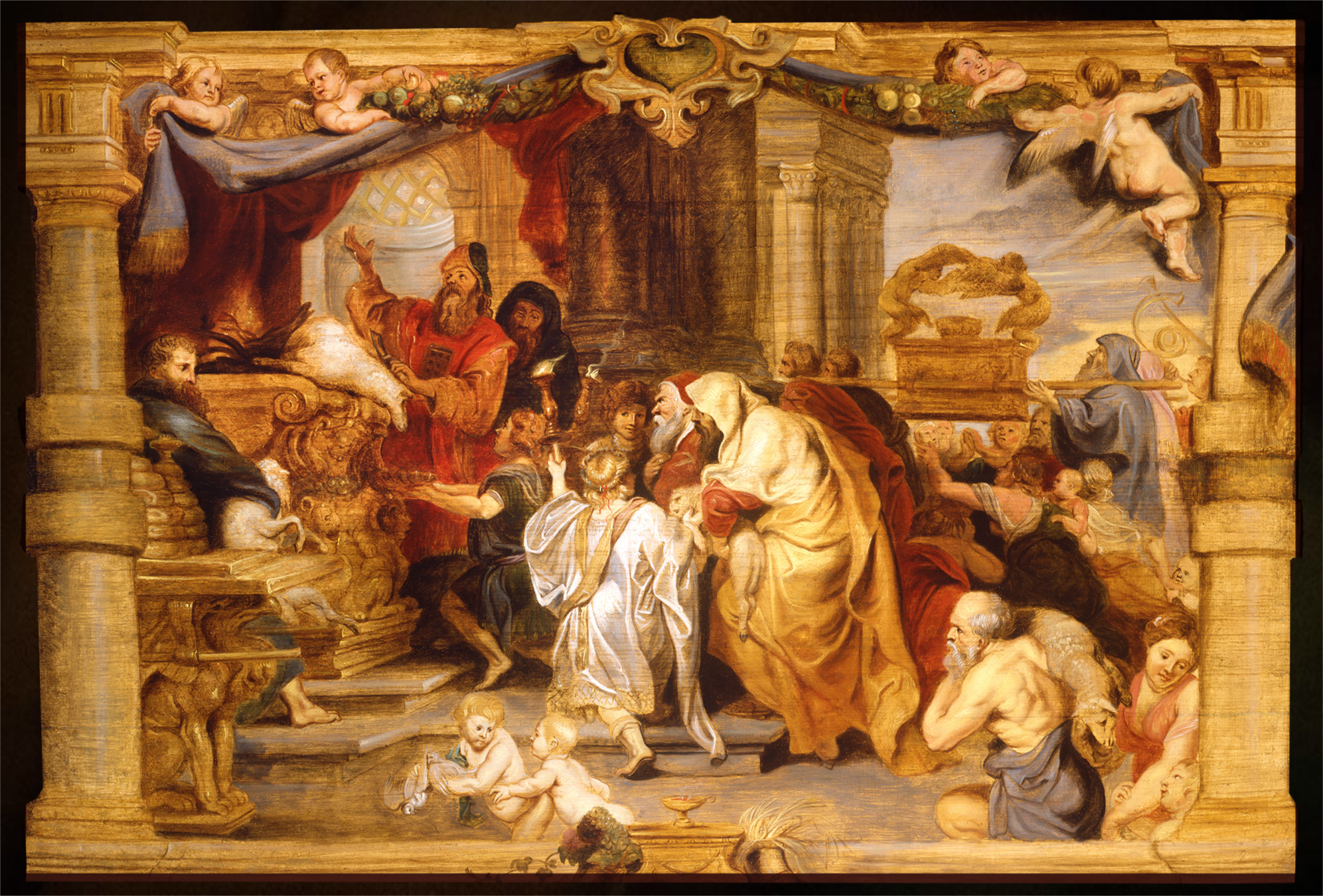
Bringing the Ark to Jerusalem
Peter Paul Rubens (and studio)
Below the image, click play to listen.
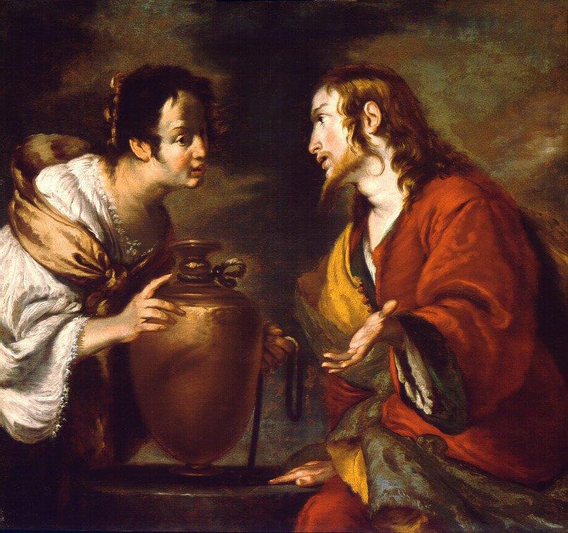
Christ and the Samaritan Woman
Bernardo Strozzi
Below the image, click play to listen.
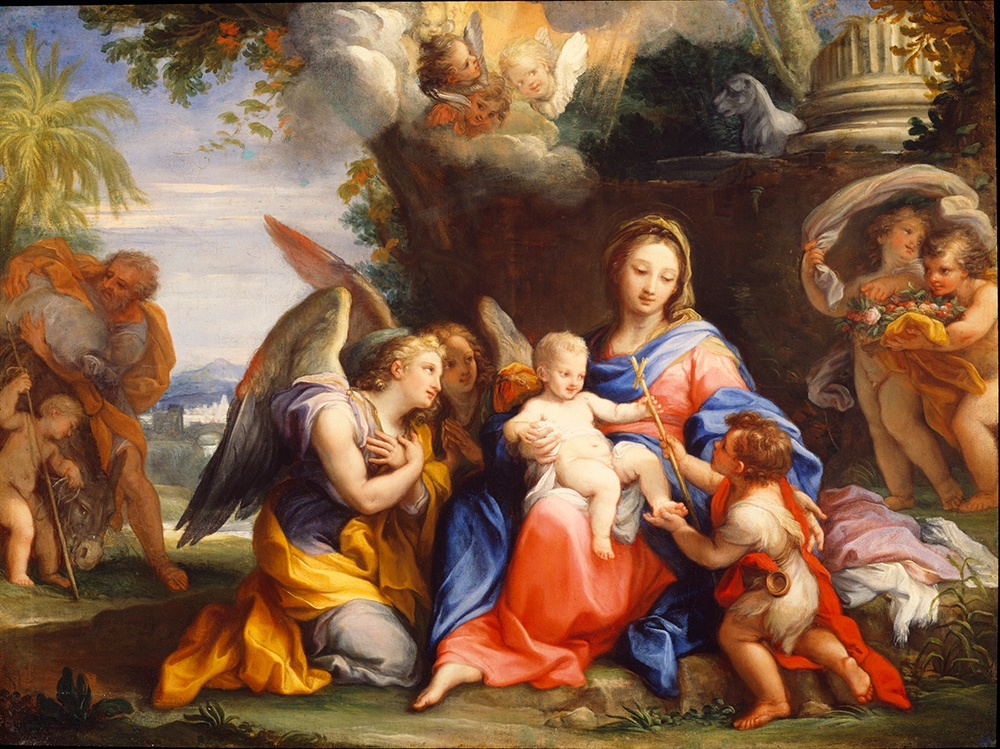
The Return from the Flight into Egypt
Oil on canvas, c. 1712
Giuseppe Bartolomeo Chiari
Roman, 1654-1727
Rome was for centuries the epicenter of culture, art, and religion. At the time of Giuseppe Chiari’s birth, it was also “the scene of a lively debate with a constantly varying interplay of influences, trends, fashions, specialized treatises, and, of course, great masterpieces” (Zuffi, p. 64). At the center of this debate were three artistic movements that Zuffi notes “succeeded one another in a sort of ideal relay race of artistic styles.” The stark naturalism of Caravaggio, the elegant classicism of Annibale Carracci, and the dramatic baroque sculptures and architecture of Gian Lorenzo Bernini would all play a part in making 17th-century Rome—well, Rome!
As president of the Roman Academy Carlo Maratta was keenly aware of these lively debates. Considered one of the most important painters in the latter half of the 17th century, he was much admired for his beautiful frescos and stunning portraits. Although his work evidenced a clear admiration for the classical tradition, several of his paintings also integrated elements of Caravaggio’s vigorous style. David Steel points out that Maratta often “managed to steer a middle course between these two dominant and often contrary trends of baroque painting” (Steel, p. 88).
Maratta was at the summit of his career in 1666 when 12-year-old Giuseppe Chiari entered the great master’s studio. Chiari soon became a star pupil. Over the years, his profound respect for Maratta’s tutelage would not only shape his artistic development but also ensure his future success in a highly competitive environment. When Maratta died in 1713, Chiari took up Maratta’s mantle and became the dominant Roman artist.
Like Maratta, Chiari broadened his appeal by becoming an astute observer and deft practitioner of integrating stylistic trends. Kathrine and William Wallace highlight this skill in their comparative analysis of Chiari’s Tedallini altarpiece with Caravaggio’s Madonna dei Pellegrini [figs. 1 and 2]:
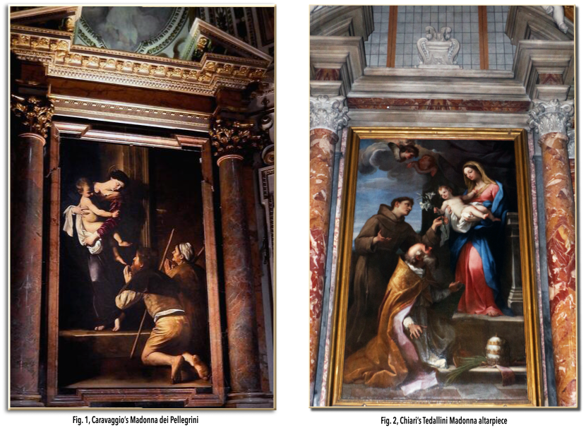
“The statuesque pose of Chiari’s Madonna, the unusually high step on which she stands, the elongated form of the Christ child framed by a white swaddling cloth, and the overall right-triangular composition recall Caravaggio’s Madonna dei Pellegrini. Yet the suggestion is subtle: Chiari has reversed the composition, naturalized the pose of the Virgin, and substituted the more palatable, well-dressed saints for the dirty feet and common character of Caravaggio’s pilgrims. Although inspired by Caravaggio, Chiari’s altarpiece remains distinctly his own. Chiari’s Madonna looks like a person of warm flesh and blood rather than the marmoreal statue of Caravaggio’s Madonna; Christ is an attractive child of sweet disposition as opposed to the enormous and ungainly figure depicted by the older master. Instead of the muted and earthy colors of the Madonna dei Pellegrini, Chiari’s bright hues are immediately pleasing and a welcome contrast to the comparatively dark paintings found on so many Roman altars” (p. 4).
The Return from the Flight into Egypt provides another example of Chiari’s virtuosity and unique style. Here, however, he turns from echoing the past to adumbrating the future. The refined handling of the paint and elegant figural poses pay homage to the classical tradition; however, the playfulness, delicate coloration, and ornamental enrichment mark the transition into the sensuous, intimate style of the rococo movement which emerged in France and spread throughout Europe in the 18th century (Chilvers, 507).
M&G has two works by Chiari on this subject, one titled The Rest on the Flight into Egypt and this rendering titled The Return from the Flight into Egypt. Over the years scholars have found the less traditional title of this 1712 work problematic. However, “the light-hearted, almost celebratory mood” (echoed in the Rococo style) reinforce the idea that here, Chiari intends to highlight the family’s return from rather than flight into Egypt. Regardless of the debate, art experts like Christopher Johns note that this picture may be the best example of Chiari’s work in America.
Donnalynn Hess, M&G Director of Education
Resources:
Baroque Paintings from the Bob Jones University Collection by David H. Steel
Concise Dictionary of Art and Artists, 3rd edition by Ian Chilvers
“Giuseppe Bartolomeo Chiari,” The Art Bulletin, March, 1968, Vol. 50, No. 1 by Bernhard Kerber and Franciscono Renate
“Seeing Chiari Clearly,” Artibus Et Historiae, 2012, Vol. 33, No. 66 by Katherine M. Wallace and William Wallace
Published 2024
Portrait of John Ruskin
John Everett Millais
Ashmolean Museum, Oxford
Below the image, click play to listen.
St. Anthony of Padua
Bolognese, 17th century
Below the image, click play to listen.
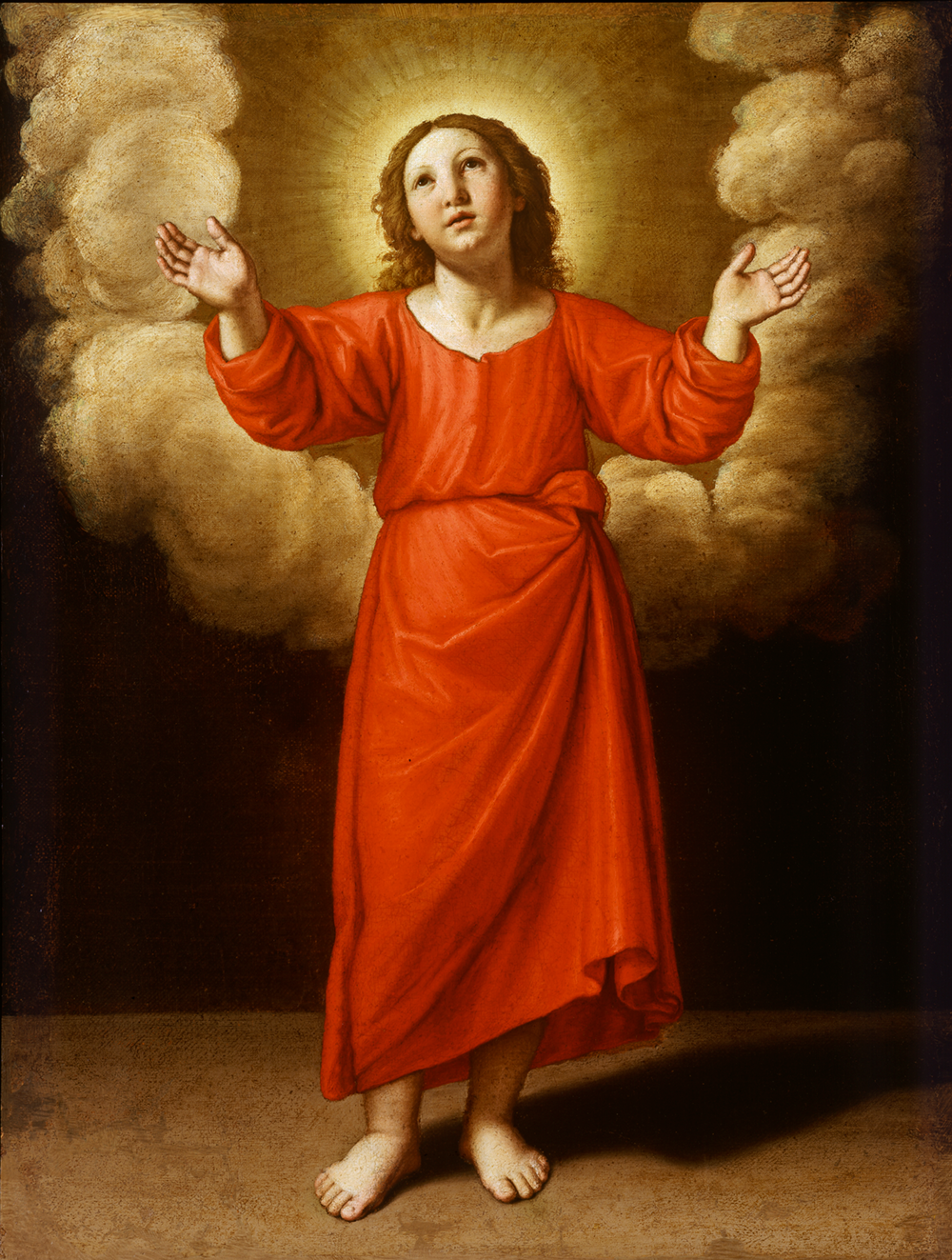
The Young Christ
Giovanni Battista Salvi, called Il Sassoferrato
Below the image, click play to listen.