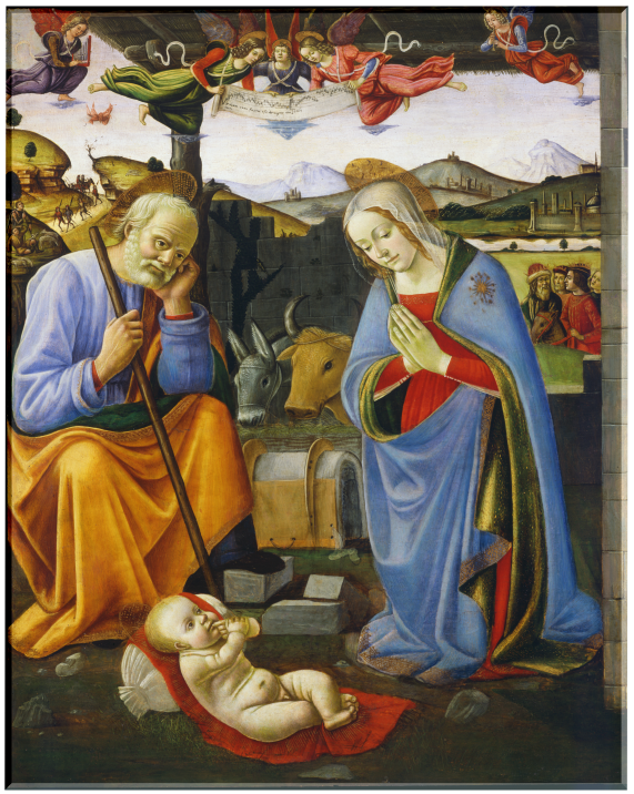
The Nativity
Master of the Borghese Tondo
Below the image, click play to listen.
Master of the Borghese Tondo
Below the image, click play to listen.
Oil on panel
Flemish, c 1500-1560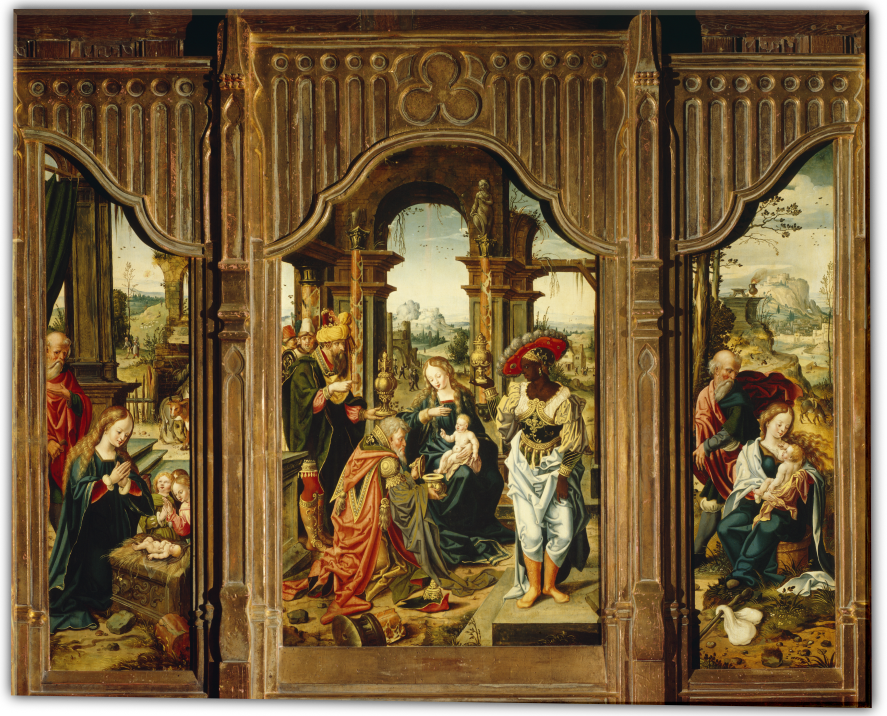
As his name states, Jan Swart came from the town of Groningen in the Netherlands. No documents tell of his training, but this painting depicts his fondness for showing people in unusual headgear. It also reveals his other work as a book illustrator. Here Swart pictures the central truth of Christ’s coming into the world, placed within the context of His early life.
M&G’s Triptych (three panels) illustrates three events in Christ’s early life: the Nativity, Adoration of the Magi, and the Flight into Egypt. The birth of Christ signified the coming of a new covenant—a covenant that forever removed the necessary demand of the Old Testament Law requiring atonement for sin before the joy of reunification and fellowship with God.
Swart unifies the three stories of the triptych through a key motif: broken architectural elements. The left panel (clearly the stable with a curious cow in the background) has the Christ-child lying on a manger of ornate stone, possibly the base of a larger pillar. But the broken pillar at the base of the marble manger (right foreground) catches the viewer’s attention because its decoration is too fine to be part of a stable and because it matches all the other pillars, especially the broken one in the foreground of the Adoration. In the Flight, the Madonna and Child are resting on a pillar’s base by the side of the road. In each panel then, Swart uses the broken columns to point to Christ’s reason for coming to earth.
However, Swart develops his illustration of the Scriptures even more, specifically within the large, middle panel. The Adoration is central to an understanding of that New Covenant that Christ came to establish. To appreciate his storytelling, one must carefully consider the motif of the number 3.

Three in Composition
Swart adorns the frame of the middle panel with a trefoil centered over the Madonna and Child. This iconography tells the viewer that the scenes are the story of the One God in Three Persons, the Trinity of which Christ is the second Person. Swart then emphasizes this truth through more tripling in the work. There are three openings in the room, which is clearly not a stable. In doing so he follows the same Scriptural distinction that the Magi came to “the house where the young child was.” Interestingly, each opening emphasizes a key character in the story:
Three Gifts
Swart does not include Joseph in this panel, though Christ’s earthly father is often part of this family scene. The reason is that the focus is on the heavenly family of the Christ. The three gifts of the magi emphasize a different family than that of Joseph’s.
Christ’s lineage through Joseph is that of the kings of Israel, perhaps another reason that he is not present: Christ’s royal claim to these kingly gifts relies on His eternal lineage, not that of His earthly father’s.
Three Magi
The three holders of the gifts are also interesting to note. Those held by the two Magi on the side are urn shape, commensurate with their gifts of oil. Logically then, the wide-mouthed lidded bowl offered by the central magus is the gold: the kneeling pose and the type of gift indicate the submissiveness of a subject to a king. Christ’s pose and gesture indicate His position as both king and priest in extending a blessing to His subjects.
Three Columns
The three ornate pillars within the middle panel are interesting as they are in differing conditions. The pillar in the foreground matches the one in the stable. But the other two frame the Christ and His mother. Perhaps Swart is showing the progressive nature of the New Covenant’s institution. One column is broken, another is empty, and the third fulfills its purpose. Christ must be born, die, and resurrect in order to complete the New Covenant. Swart again uses the number three to tell the story of Christ, even as an infant, has set in motion the redemption of the world.
Dr. Karen Rowe, M&G Board Member
Published in 2019
Polychromed and gilt wood
Unknown Spanish, 15th century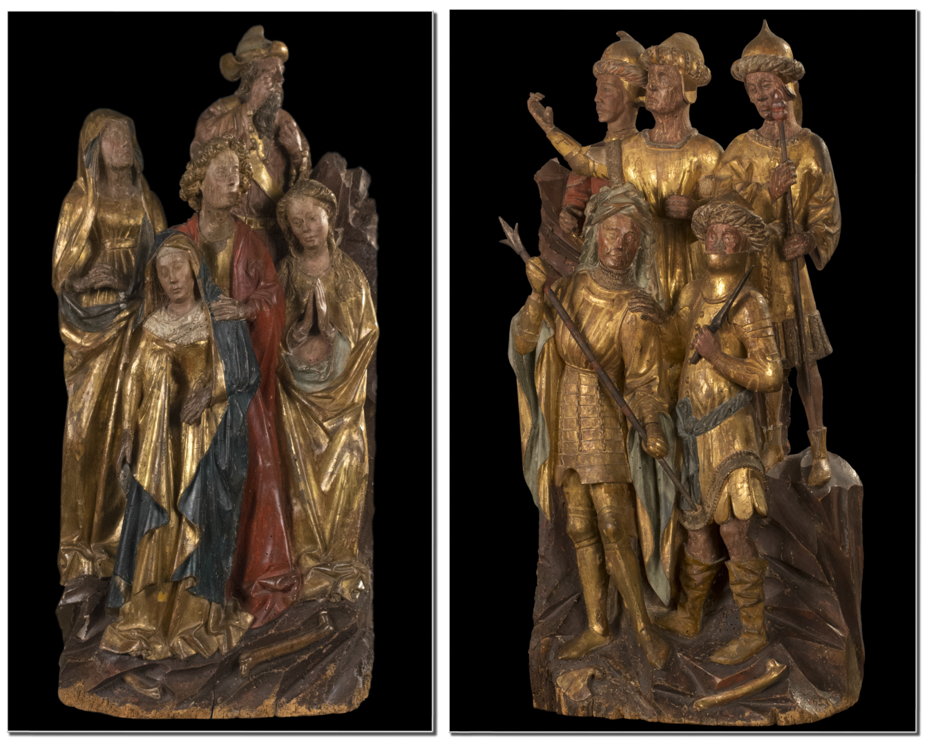
Although the title Watchers and Soldiers from a Crucifixion Group seems insipid at first read, these two small polychromed and giltwood sculptures provide fascinating insights into an architectural style and installation of extreme magnitude. During the reign of Ferdinand and Isabella, the Spanish monarchs who commissioned Columbus’ 1492 voyage to the Americas, the Isabelline style of architecture was developed. Born in France and trained in Flanders, Juan Guas settled in Toledo to establish his business. He is considered one of Spain’s finest architects and one of the key originators of the Isabelline style, which combines a Flemish-Gothic influence with Mudéjar (Spanish-Muslim) ornamentation. His design influence is represented in the monumental edifices at the San Juan de los Reyes and El Paular monasteries.
M&G’s two figural groups date to the second half of the 15th century and according to William Holmes Forsyth, the late curator emeritus of medieval art at the Metropolitan Museum of Art, “They are from a retable or retablo of Spanish origin, but southern Netherlandish in inspiration.” Beatrice Gilman Proske, the former research curator of sculpture at the Hispanic Society of New York who authored the catalog for the famed outdoor sculptures of Brookgreen Gardens, noted that they are Flemish. It is not then a stretch of scholarship to assume that these two sculptures measuring 32” high by approximately 15” wide, would have commanded a prominent place flanking the carved crucifixion of Christ, a common focal point in many retables from the Low Countries of the time. The Carved Retable of the Passion of Christ, part of the collection at the National Gallery of Victoria in Melbourne, Australia, presents a prime example.
At the base of each carving’s scene amidst the jagged rock are bones resembling those from the lower torso and limbs of the human body. These skeletal remains add a sobering reminder that Roman crucifixion included the breaking of the leg bones in order to hasten the impending death. Moreover, the crucifixion of Jesus, as noted by all three synoptic Gospels, occurred on Golgotha or “the place of the skull.”
Positioned on these rocky formations, the Soldiers are each individualized by gaze and weaponry and robed in medieval armor and Moorish headdress, hinting at the Mudéjar influence. The sculptor clearly draws our attention to the only soldier gesturing and glancing upward, perhaps depicting the centurion cited in the Gospels of Matthew, Mark and John. Church history, tradition, and pseudepigrapha all ascribe the name of Longinus to this legionnaire, but Scripture allows him to remain anonymous, recording for all time only his striking statements, “Truly this was the Son of God” (Matthew 27:54) and “Certainly this was a righteous man.” (Luke 23:47)
Unlike the soldiers, the Watchers from a Crucifixion Group can be decoded from Bible references, religious iconography, and an abundance of artistic renderings of those who attended Christ’s crucifixion. The repertoire is rich as set forth in examples such as El Greco’s Crucifixion, and Jan Van Eyck’s.
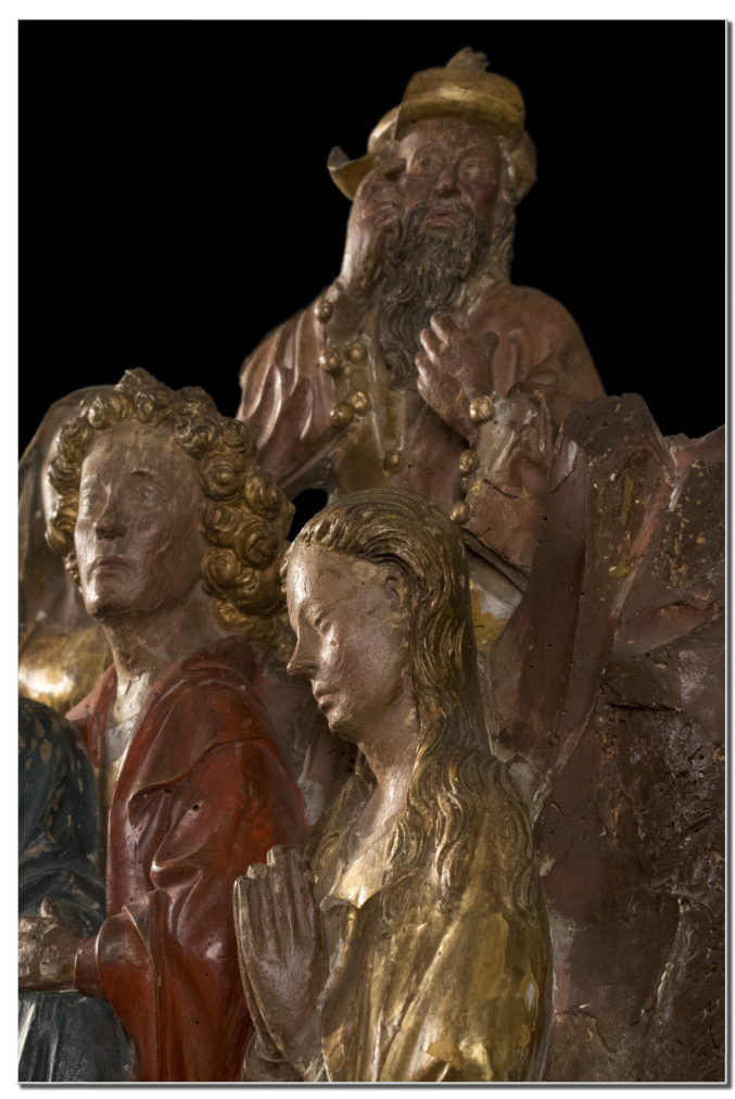 At center front Mary, the mother of Jesus, robed in blue (alluding to heaven, truth, and mourning) and white (for purity and innocence) is comforted by the obviously young apostle John draped in red (for love). On either side of him stand the two Marys, clearly identified in the crucifixion passage in John’s gospel as Mary the wife of Cleophas, and Mary Magdalene (recognized by her long hair as a penitent saint). In the background, towering above the rest of the group, is most likely Joseph of Arimathea, who provided the burial tomb for Christ; he is presented as elderly and robed in the costly garments of the rich. The sculptor carved this individual with an intriguing gesture. With his right index finger raised to his temple, perhaps Joseph is recalling the Scriptures he memorized while serving as a Sanhedrin senator attesting to the deity of Jesus, the Christ.
Bonnie Merkle, Docent and M&G Databases Manager
Published in 2019
Polychrome and giltwood walnut
Austrian, 1570-1630
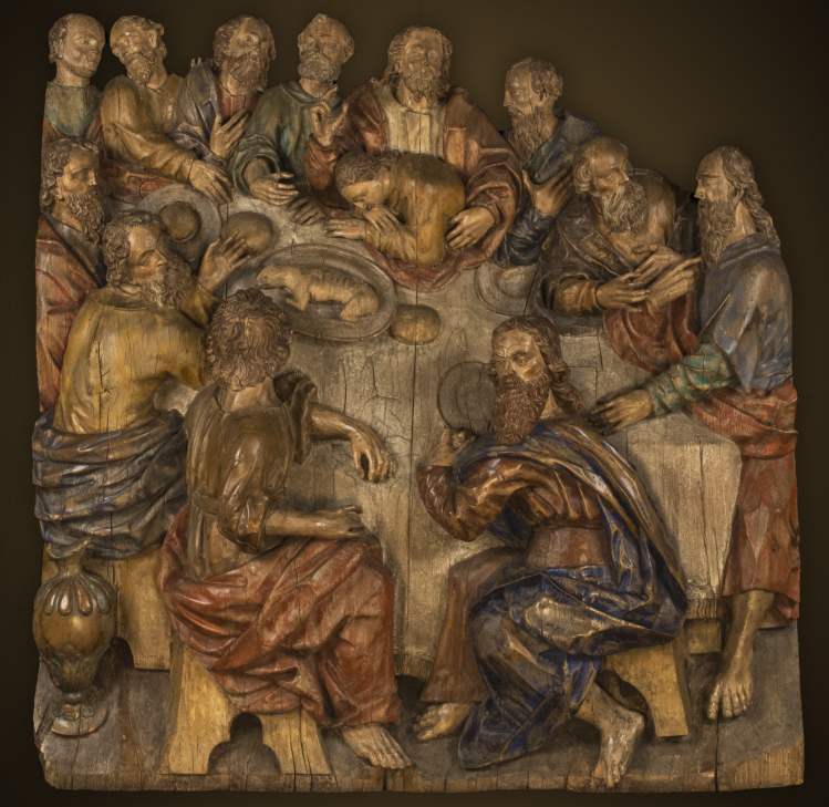
One of Scripture’s more commonly depicted stories in art is the Last Supper. This event is represented repeatedly in M&G’s own collection in at least three paintings (on both canvas and panel), a Greek icon, book engravings, Sitzendorf porcelain, and wood sculpture.
Created around 1625, M&G’s sculptural Last Supper is attributed to Hans Waldburger, an Austrian artist in both wood and stone. Little is recorded about him, but he learned his craft from his father, Hans Leonhard Waldburger, while growing up in Innsbruck, Austria. Hans was later guided by Alexander Colin and Hubert Gerhard, a northern follower of the influential Michelangelo-emulator, Giovanni Bologna (or Giambologna).
During Waldburger’s life and work, there was a cultural shift through the influence of both the Protestant Reformation and the Roman Catholic Counter Reformation. Artistically, that transition was expressed through the Mannerist style briefly bridging the movement of the simple, idealized forms of the Renaissance to the busy, dynamic embellishment of the Baroque. This developing ornamentation was articulated in a highly decorative, theatrical style often combining painted imagery with sculptural elements giving the illusion of the story emerging from the flat surface—almost coming to life.
Early in Hans’ career he was commissioned by Archbishop Wolf Dietrich von Raitenau to Salzburg, where he essentially spent the rest of his life. Much of his known work is represented in Austria including such fine examples as the High Altar at both the Basilica Mondsee and Salzburg Cathedral.
M&G acquired The Last Supper in 1963. It is roughly 400 years old and still retains much of its painted color (polychrome) and gold leaf (gilding) in places. Hans’ mannerist style is noticeable in the extended physical features of the apostles as they are seated around the table. The possible supper conversation may be the point in the story when Christ reveals that one of the twelve disciples would betray Him. Their response was, “Is it I?” as recorded in the gospels (Matthew 26:22; Mark 14:19). Though it is known in the culture of Palestine that the partakers would have reclined during the meal, here the group is seated around a table. The sculpture measures approximately 4 feet wide by 4 feet high, and it is almost 1 ½ feet thick! Remarkably, the figures’ distinctive details including curling beards, facial features, and gesturing hands are still intact.
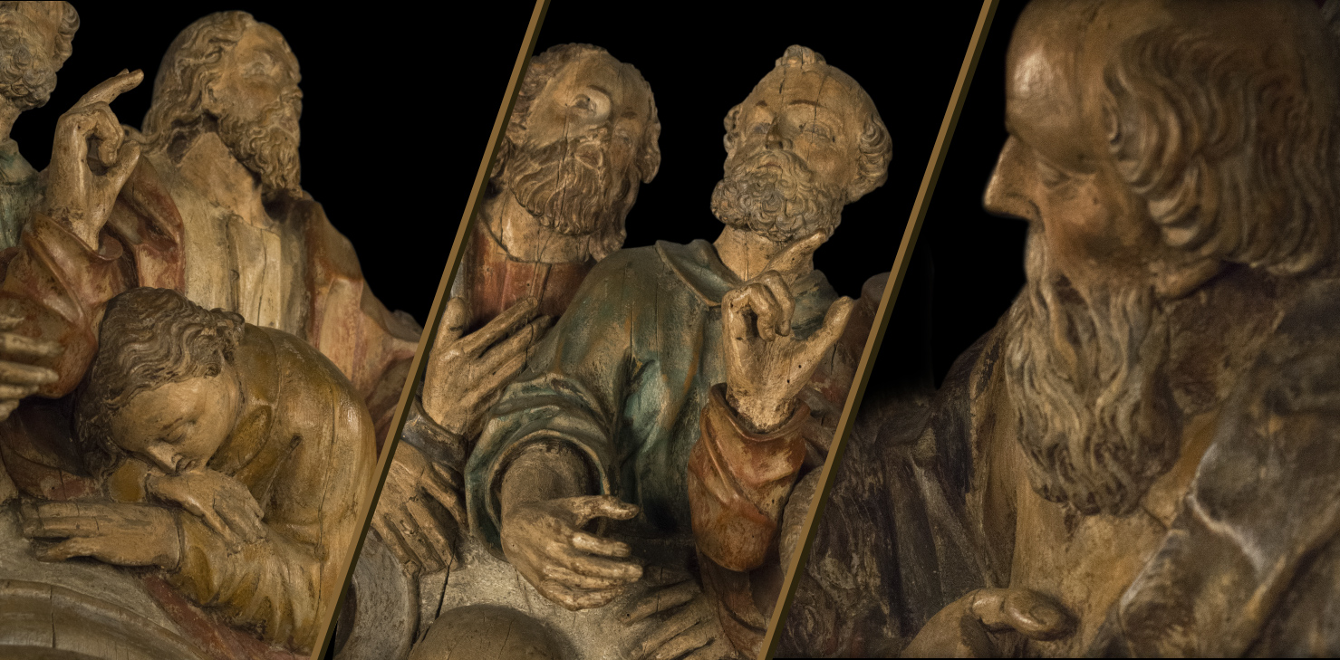
Dealer Edward R. Lubin summarizes the beauty and impact of Waldburger’s Last Supper, “A monumental, virtually in-the-round sculptural group of such quality and scale in this period of German art is truly exceptional.”
John Good, Security Manager
Published in 2019
Polychrome and Stucco, c. 1400s
Florentine, 1427-1479
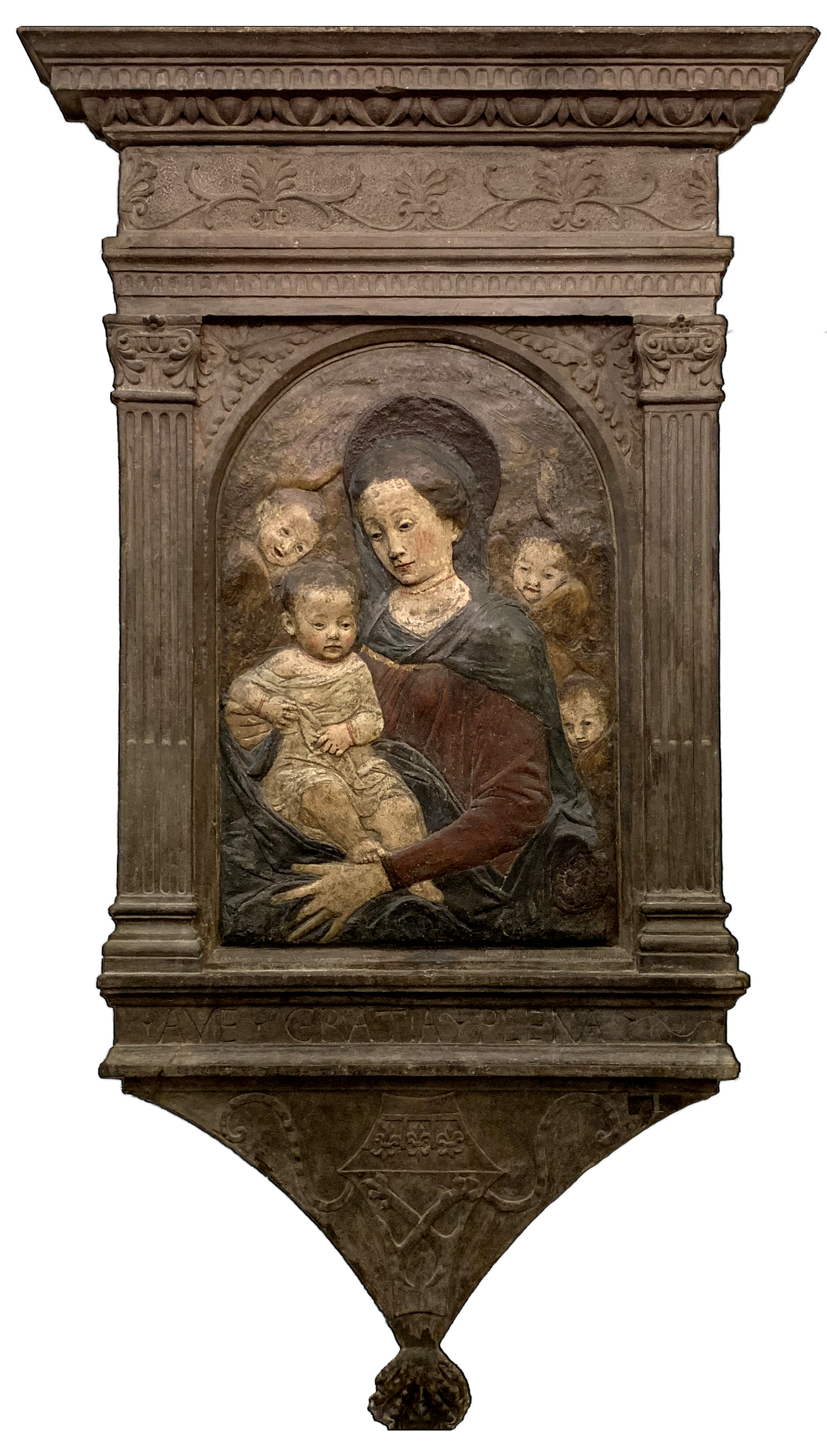
Sculptor Antonio Rossellino was born into a family of masons—the youngest of five, talented sons and learning his craft from his older brother, Bernardo. Because of his hair color, Antonio earned the name, Rossellino, which means “little redhead.”
Antonio’s most famous work was completed in 1473 for the Burial Chapel of the Cardinal Prince Jacopo of Portugal found in San Miniato al Monte in Florence.
He worked with multiple artists to design and complete the Chapel including Luca Della Robbia, the distinguished terracotta sculptor and glazer. This remarkable collaboration of artists allowed creativity and beauty to spring forth figuratively and literally from stones and dirt.
M&G’s relief sculpture of Rossellino’s Madonna and Child is representative of a popular image that was painted, carved, and sculpted repeatedly during the Renaissance period. Image fatigue has not set in; we still find the subject appealing in the same way that we enjoy a sunset’s beauty night after night.
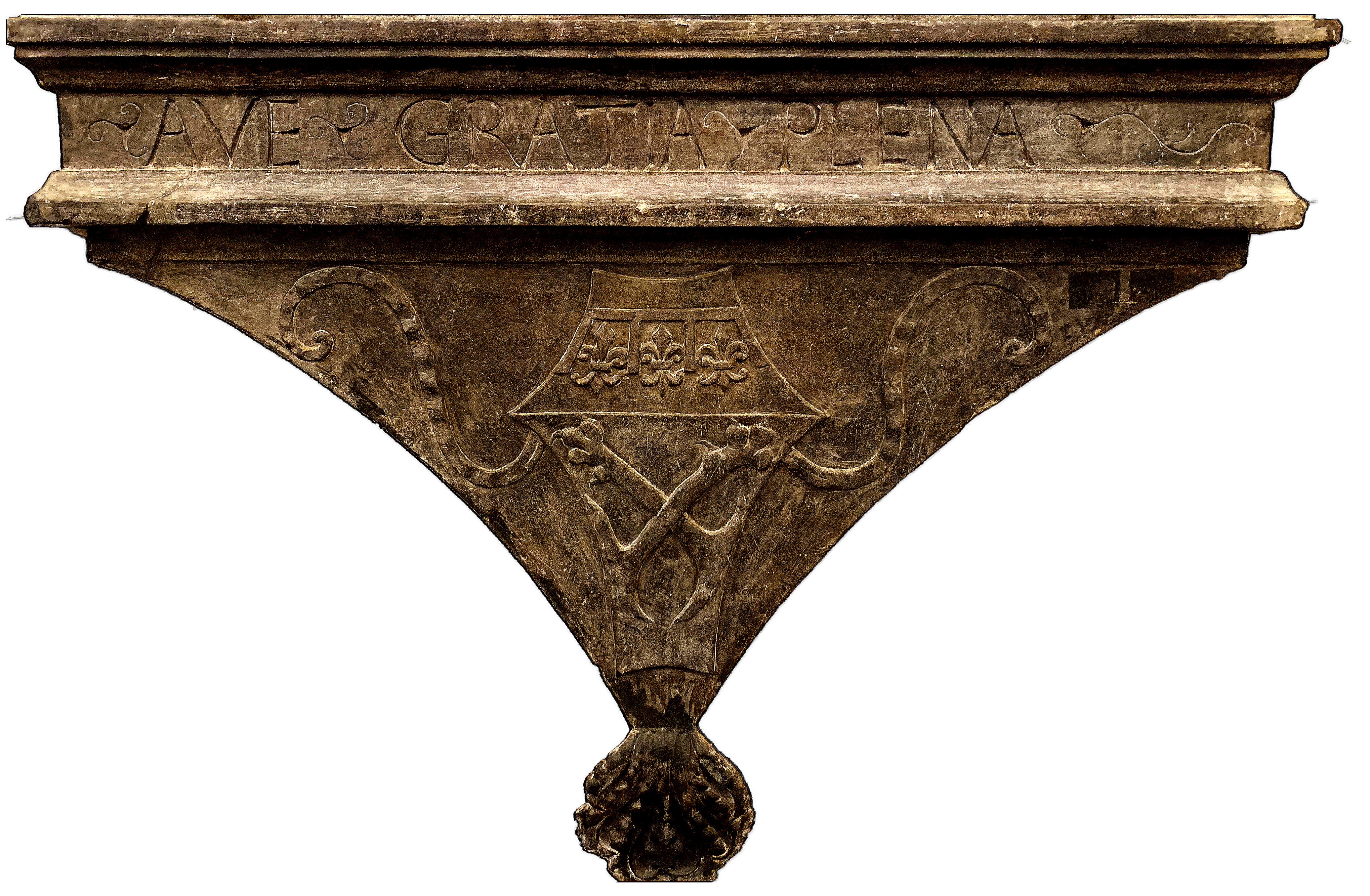 Studying the sculpture’s tabernacle frame, we notice the words: Ave, Gratia, and Plena. The translation of which is “Hail, Full of Grace”—a greeting perhaps at the entrance of the family home or private chapel. Below the inscription are carved three fleur-de-lis and the crossed fore-legs of the lion. More than likely, this relief was made for the Morelli family, a prominent family from Florence, whose coat of arms includes the crossed fore-legs of the lion. The fleur-de-lis is the symbol of Florence, originating in the medieval era.
Both Mary and Christ are painted in their customary colors of red, blue, and white symbolizing love, faith, and purity. Mary’s fingers are delicately rendered in terracotta. Surrounding the mother and child are three, winged angel heads carved without bodies, possibly cherubim. Traditionally, angels were viewed as messengers and protectors of the righteous. How fitting for Rossellino to include angels in his portrayal of Christ considering Scripture’s promise in Psalm 91:10, 11, “For he shall command his angels concerning you to guard you in all your ways. On their hands they will bear you up, lest you strike your foot against the stone.”
Angie Snow, M&G Educator
Published in 2019
Walnut
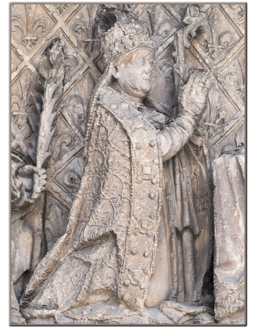
Spanish, mid 15th century

A chair, from the English chaere or Latin cathedra, is one of the most common pieces of furniture and easily identified in its simplest form by its parts—back, seat, arms and legs. The chair’s specific purpose can be discerned by more descriptive names such as recliner, wheelchair, throne, etc. Of course, the person “who takes a seat” can further outline the chair’s scope such as the Queen of England positioned in The Chair in the House of Commons to open a new session of Parliament, a ruling monarch seated on a throne to make a solemn declaration, or a bishop (such as the Pope, known as the Bishop of Rome) adopting a position in a cathedra or cathedrae apostolorum (as it occurs in early church writings) to teach with apostolic authority.
The Museum & Gallery’s furniture collection from the fourteenth to sixteenth centuries is known as the most extensive representation in America and includes several types of ecclesiastical chairs, four of which are cathedrae. Each of the four has interesting designs and carvings, but the oldest in the collection possesses by far the most intriguing and traceable features.
Gazing from the back panel of the Cathedra is a sculpted female figure representing St. Lucy, one of the most venerated female saints in martyrology and mentioned in the Catholic mass itself. She holds two objects: a palm frond, symbolic of victory in death and a platter with eyes, her most common and legendary attribute.
Just under the seat panel is a misericord. Since many of the medieval and early Renaissance ceremonial prayers were uttered in a standing position, the misericord acted as a place to “rest” or lean on during the long ceremony thereby allowing the bishop to obtain a type of “mercy.”
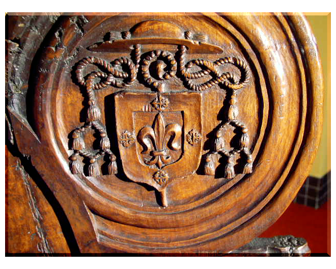 This Spanish Cathedra dates with certainty to the 1400s due mostly to the identifiable coat of arms of Bishop Alonso de Burgos, born in 1415 in Burgos, Spain, the capital of Old Castile. The galero or pilgrim’s hat and tassels were common elements of the crest of a bishop, with the center shield denoting a particular symbol of heritage or character, in this case a lily in the stylized form of a fleur-de-lis, which is a symbol of purity. Alonso’s influence as a bishop was widespread as he served in the central Spain dioceses of Cordoba, Cuenca, and Palencia. Ordained as a Dominican monk at an early age, Alonso so earnestly and diligently applied himself to his vocation as a Catholic clergyman that he was readily noticed and subsequently assigned as confessor by the renowned Catholic Monarchs, a collective term for Spanish King Ferdinand II and Queen Isabella I, under whose banner Columbus sailed.
 Beyond being instrumental in the financing of some of the voyages of the discoverer, Bishop Alonso’s influence was exhibited in founding a center for Dominican study, the Collegio de San Gregorio, an Isabelline-style building located in the city of Valladolid. Readily visible throughout the architecture is Alonso’s heraldry.
Bonnie Merkle, M&G Docent and Database Manager
Published in 2019
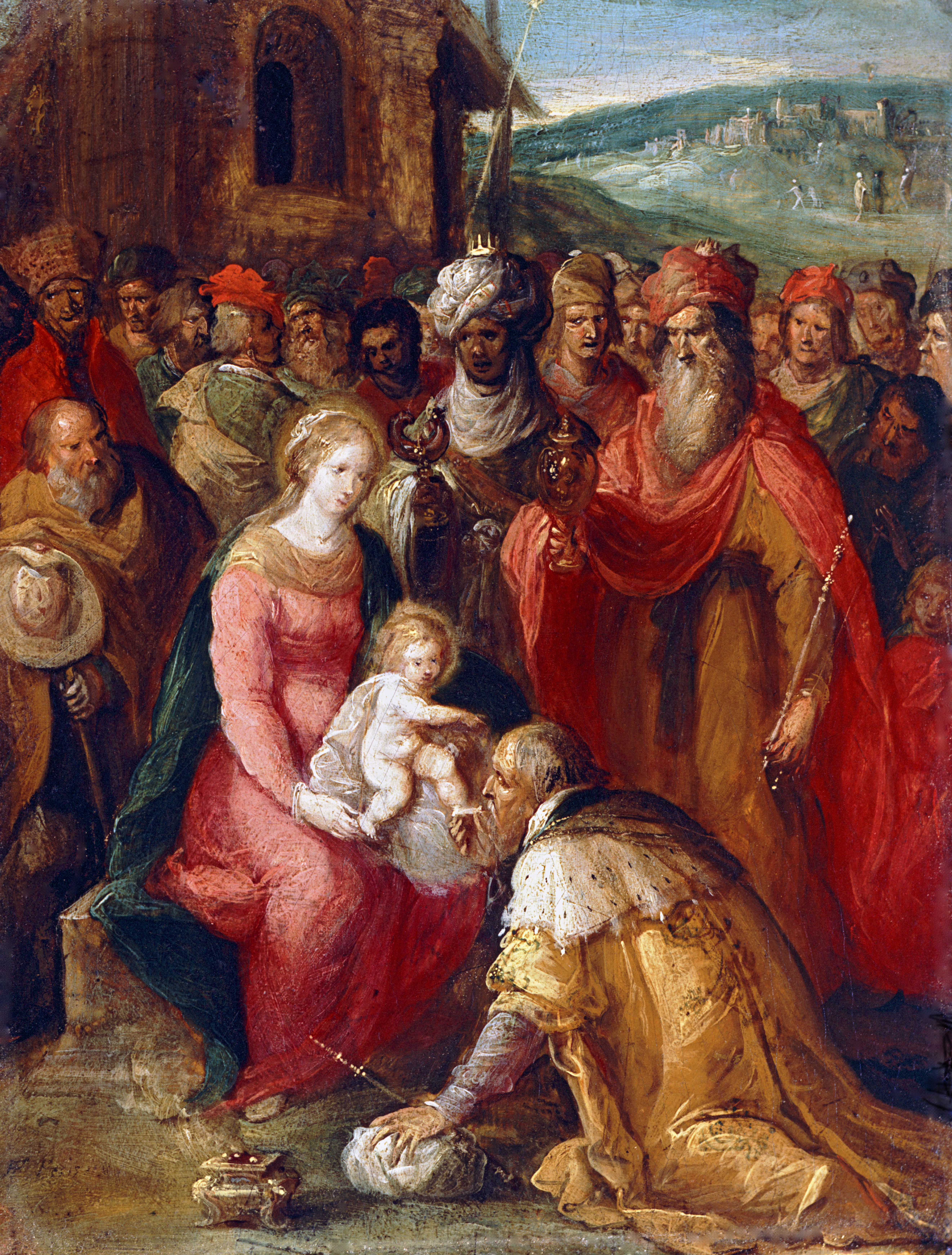
The Adoration of the Magi
Frans Francken, the Younger
Below the image, click play to listen.
Polychrome and parcel-gilt
Florentine, c. late 15th century
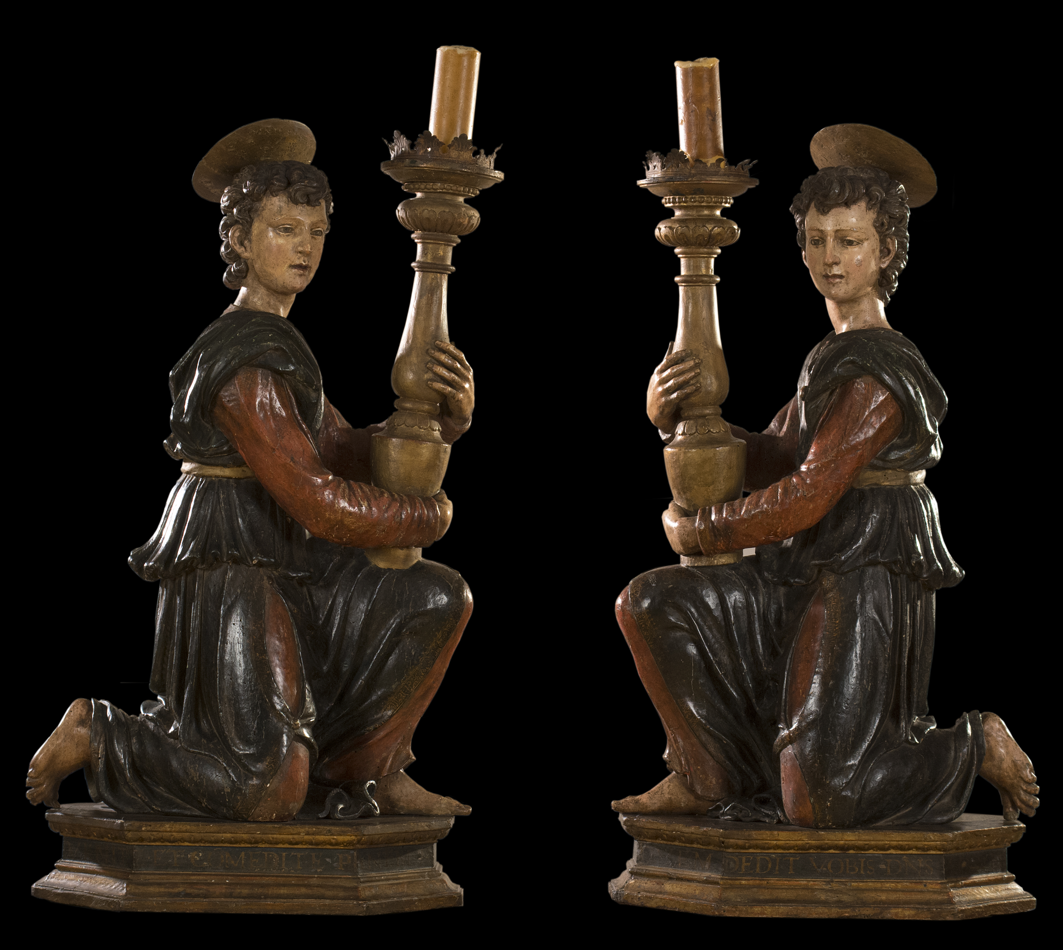
Since paintings in an exhibit often take “center stage,” ecclesiastical pieces like these Angels with Candlestick can be overlooked by museum viewers. During the Renaissance, however, a polychrome sculptural grouping would often be the centerpiece of an altar’s decorative scheme while the painted narrative scenes or figures functioned as the “wings” of the altar. Although by the end of the sixteenth century, paintings became the central focus of Italian altarpieces, while sculpture continued to be used extensively in other countries like Spain.
The term polychrome (meaning “many colored”) refers to the application of colored materials to sculpture in order to present a more life-like quality. This technique dates back to the Greeks and Romans and was particularly popular during the Renaissance. Because these pigments fade over time such coloring is rarely discernable today. The good condition of these statues is due to the porous wood used which retains color well.
We know that the figures shown here were meant to be angels from the metal pins that remain on the back of each figure—a clear indication of the wings’ placement. Sadly, it is not uncommon for such appendages to be broken off or lost over centuries of movement from place to place. Fortunately, the carved wooden haloes have remained intact, as has the original base with its Latin inscriptions.
Since several of the words are Latin abbreviations, the precise translation of the inscriptions is unclear. However, a loose reading would be:
OVEM DEDIT VOBIS DNS ADVES CENTVIM
Dedicated to the Lord’s Advent
VENITE ET COMEDITE PANEM
Come and eat bread
ANGE ORVM
Angels
Donnalynn Hess, Director of Education
Published in 2018
Vellum
Italian, 16th century
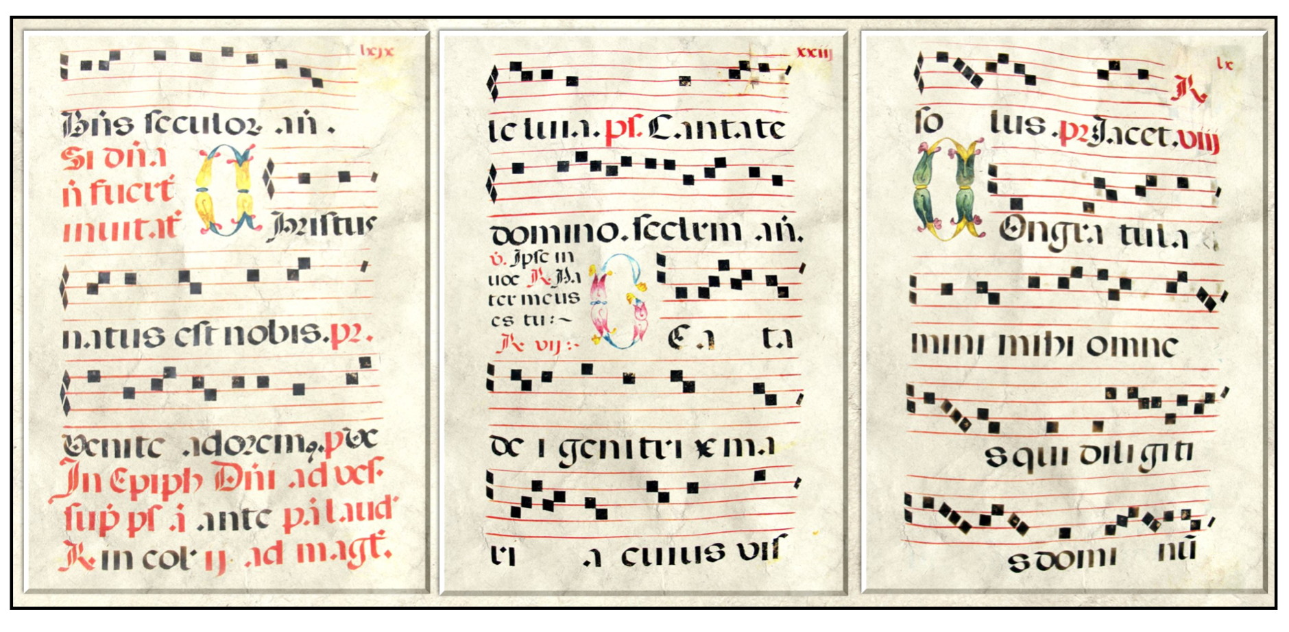 Antiphonary pages from the Museum & Gallery at Bob Jones University
Antiphonaries are collections of various chants sung for the prayer hours, the Divine Office, of the Western church. Such collections date as far back as the eighth century. The chants consist primarily of antiphons and psalms. In the Middle Ages all 150 psalms were sung each week during the Divine Office.
Antiphons were musical and textual additions which anonymous medieval composers added to the chanting of the psalm. Most often the antiphon texts were carefully selected to match the content of the psalm at hand. They could be drawn from other biblical passages, including the New Testament, from older hymns, or from new, original texts. For example, for the chanting of Psalm 23, the antiphon text might have been from John 10:11, “I am the good shepherd.” This antiphon text would be sung before and after the chanting of the psalm, forming a musical frame.
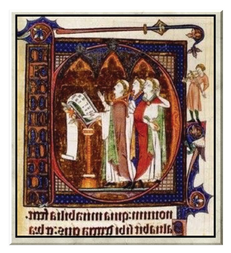
The collections would be organized according to the church calendar and within that according to the order of the prayer hours beginning with Matins. Antiphonaries are generally quite large because the choir would stand around it in a group in order to sing from it, similar to the picture below. A large music stand held it at the proper level.
The Antiphonary in M&G’s collection dates to the beginning of the 16th century. It came to M&G in 1960 acquired at an auction on November 11 and 12 at the Parke-Bernet Galleries from the Myron C. Taylor Collection, NY.
M&G’s Antiphonary is incomplete, consisting of 154 leaves (pages). The parts of the church calendar within it include the Offices for the Christmas feasts, the Circumcision, the Epiphany, the Ascension, and Pentecost. Notably absent are the services for Easter.
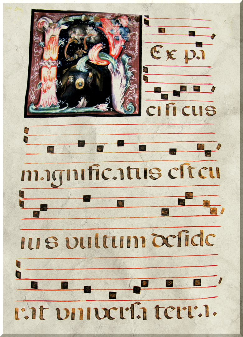 Similar to many other antiphonaries, this one also illuminates and decorates many capital letters. The first line of this page reads Rex pacificus magnificatus translated as “The King of Peace is magnified.” The first letter, the R, contains a nativity scene, colored in pastels, appropriate to its position for Vespers on Christmas Day. M&G is beginning to translate the leaves in the antiphonary and orient them to their position in the church calendar and order of service.
Dr. Karen Wilson, M&G volunteer and retired music professor from Bob Jones University
Published in 2018
Italian, 16th century Italian, late 16th to early 17th century
Click on links for additional reference information.
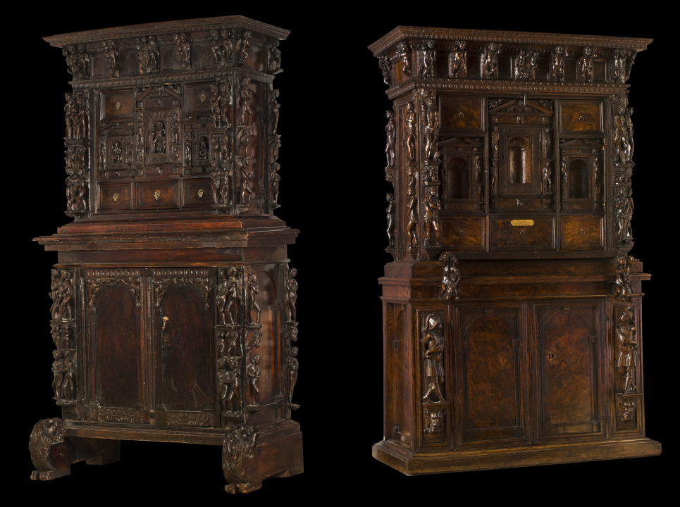
Most of us at one time or another have treasured and tucked away some poem, theme paper, or letter. Your paper valuables may have been stashed in a simple cardboard box, but if you were living in Italy between 1560 and the early 1600s in the thriving cities of Genoa or Florence, your written mementos may have been stored in a tall, desk-like piece of furniture called a Stipo a Bambocci, loosely translated “a cabinet with carved babies.” As the style became popular, more iconographic carvings embellished the desk’s exterior, which is typical of the emerging Baroque period. Yet, the name’s association with “babies” persisted.
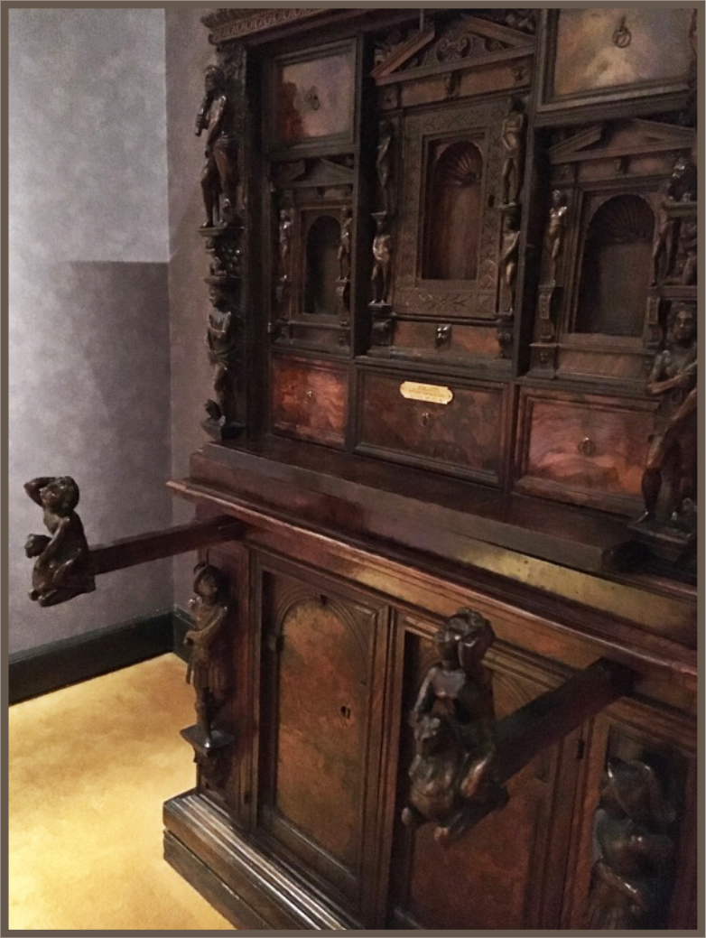 Beautifully fashioned out of two kinds of wood—burled-walnut and Caucasian walnut, the upper portions of the desks (not usually created at the same time as the lower cabinets) are completely removable, allowing a nobleman to tote just the top portion of his desk on his travels. The interiors, laden with multiple drawers and hidden caverns, beckon the imagination as to what might have been secretly stored within! Most often, a stipo a bambocci was secured with a lockable, fall front writing surface. Supported by lopers when lowered, the false front becomes positioned at a comfortable height for writing.
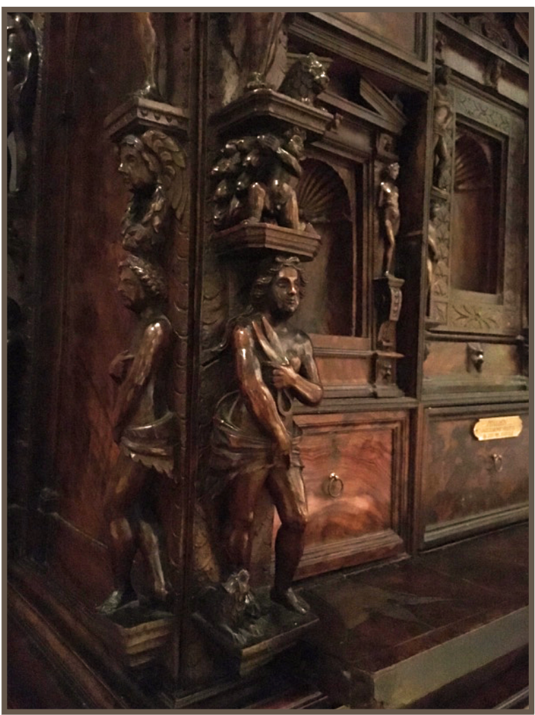
Mimicking the design of an Iberian desk called a bargueño, the production of stipi (plural for stipo) was short lived, a mere 60 to 70 years. Yet their substantial influence can be seen in a more common piece of furniture today known today as an escritoire or secretary.
Little is known about these early furniture makers; however art historian, Dr. Thomas Meyer, discovered in 2008 that Riccardo Taurini and his workshop were craftsmen of a specific stipo. Meyer notes that the family of Taurini is considered to be the “fathers” of the stipi, blending their designs with inspiration from famous artists, architects and sculptors such as Rosso Fiorentino, Jacques I Androuet du Cerceau, Hugues Sambin, Leon Battista Alberti, Giacomo Barozzi da Vignola, and Andrea Palladio.
Almost as interesting as the desks’ construction are the various personages who formerly owned M&G’s unique pieces—the Royal Family of Savoy; an Austrian Archduke living in Lichtenstein Palace, Vienna; Myron C. Taylor, President Roosevelt’s personal representative to Pope Pius XII during World War II; and the industrialist and avid collector, Carl W. Hamilton of Philippine Refining Corporation. It is intriguing to consider what documents might have once been composed upon or stored within these beautiful pieces of furniture!
Though stipi are most often found today in house museums such as Museo Poldi-Pezzoli, Bagatti-Valsecchi and in the Castello Sforzesco, it is no surprise that M&G has two such unusual desks. M&G’s furniture collection (which includes approximately 100 pieces predominately from the 1400s and 1500s) is almost as renowned as its collection of Old Masters. Joseph Aronson (1898-1976), an international European furniture authority, once remarked that “it is one of the finest collections of Renaissance furniture in America.” Aronson’s work, Furniture in the Bob Jones University Collection, as well as other significant volumes such as A Concise History of Interior Decoration by George Savage and A History of Italian Furniture by William M. Odom, both review these two stipi, and qualify M&G’s collection as a must-see for furniture lovers and historians everywhere.
Bonnie Merkle, Collection Database Manager and Docent
Published in 2017
M&G at BOB JONES UNIVERSITY; 1700 Wade Hampton Blvd - Greenville, SC 29614